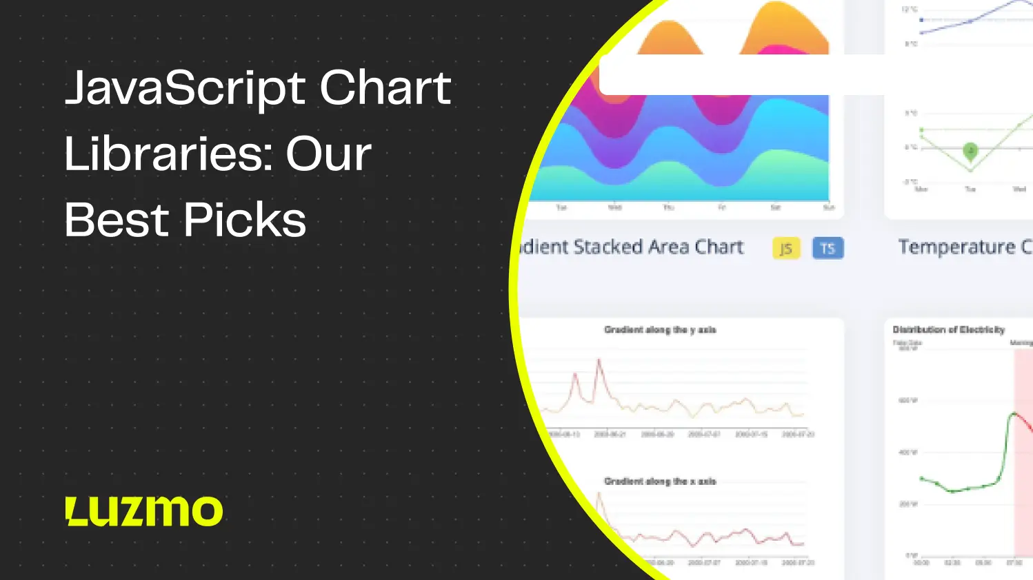
JavaScript Chart Libraries In 2026: Best Picks + Alternatives
A software application has many moving parts, and data is at the heart of it all. But how do you make rows and rows of raw data understandable for your users? That’s where data visualization comes in.
JavaScript chart libraries are one of the most common ways to add data visualizations to an app. But with so many libraries to choose from, each with their own pros and cons, you can easily get overwhelmed. Instead of spending hours on research, we’ve done the heavy lifting for you.
In this article, we’ll compare the JavaScript visualization libraries, what you can use them for, and other alternatives for the job.
What is a Javascript chart library?
A Javascript chart library is a toolkit for developers to visualize data as charts. It comes with pre-built components for different chart types, which you can integrate into your broader codebase.
Back in the day, a programmer had to collect data from different types of databases, and manually code charts and dashboards to visualize that valuable data. Today, you can use a chart library as a reusable blueprint for your charts and dashboards.
The most common use case for chart libraries is creating visualizations within an app. For example, a dashboard in a social media scheduling tool showing post engagement across different channels.
Why do you need a JavaScript charting library?
1. Chart libraries are reusable
For most developers, data visualization isn’t the main focus of their app. But let’s face it—visuals matter. With JavaScript charting libraries, you can create custom charts and graphs without starting from zero. Start from existing code and make the customizations you need.
2. Strong community support
Especially with open-source libraries, there are plenty of communities online (such as GitHub) where you can find support. If you get stuck solving a specific problem, there’s probably someone else that had it before. You can look up a solution quickly or go through tutorials and demos to find out how to do something.
3. A large selection of libraries to choose from
With a little bit of research, you’ll easily find hundreds of chart libraries to use. You just need to find the one that suit your needs in terms of ease of use and visualizations. As you’ll learn later in this article, not all chart libraries have all the visualization types, so it’s worth shopping around to find the best one for your development team’s needs.
How to display a chart in JavaScript?
The short answer is: there’s no single way to create a chart in JavaScript. Every chart library uses different properties, and some will support different chart types than others. But in general, you’ll start with a code template and then customize charts to your liking. For example, chart libraries may let you:
- Change the data source
- Change the chart type from e.g. bar chart to pie chart
- Change the appearance of the chart such as colors, borders, legends,...
- Add interactivity like filtering, tooltips, drill-downs, triggering actions,...
However, do your due diligence before you start building charts with just any library. Make sure to write out all your requirements and choose a library that matches your needs. You don’t want to waste time building 90% of your visualizations, only to find out that your library of choice doesn’t support stock charts (or any other visualization you need).
What are the best JavaScript charting libraries?
If you’re just getting started with data visualization, here are the 11 most popular JavaScript visualization libraries to consider.
D3.js - the best all-rounder
The most commonly used chart library is popular for a good reason. D3.js is one of the most powerful and flexible libraries out there - and it’s free! You can create really complex custom charts and it works with various formats such as CSS, SVG, and HTML. With dynamic DOM manipulation, you can build super interactive data products that change as your data changes.
On the flip side, it can be really daunting for developers with no experience in data viz. Expect a steep learning curve.
If you need full control over data visualization and interactivity, and you don’t mind a challenge, D3.js is for you.
October 2025 Update: D3.js is still the go-to library that uses pure JavaScript to build complex, data-driven visuals. Its flexibility keeps it a favorite for web designers who want to create custom html5 charts from scratch. While libraries mentioned like Visx and Nivo make things easier, D3 remains unmatched for control, animation, and interactive tooltip precision.
Chart.js - best for teams on a budget
Chart.js is open-source and completely free to use. With eight different types of data visualizations, it’s not the most comprehensive library, but it sure is easy to use! It has detailed developer docs to help you with chart creation, whether it’s pie charts, line charts, radar charts, or others.
If you’re looking for high performance analytics, Chart.js is a great contender. It renders chart elements on an HTML5 canvas, which is much faster than rendering as SVG, like most D3-based libraries do. And with many available plugins, you can get even more out of Chart.js.
If you need a quick and easy solution for a small visualization project, Chart.js is perfect!
October 2025 Update: Chart.js keeps winning developers with its free and open source model and easy setup. Recent updates improved animation, zoom and pan control, and plugin flexibility. Still easy to implement, this lightweight library now has thousands of extensions available in the market, making it a strong pick for quick dashboards and prototypes.
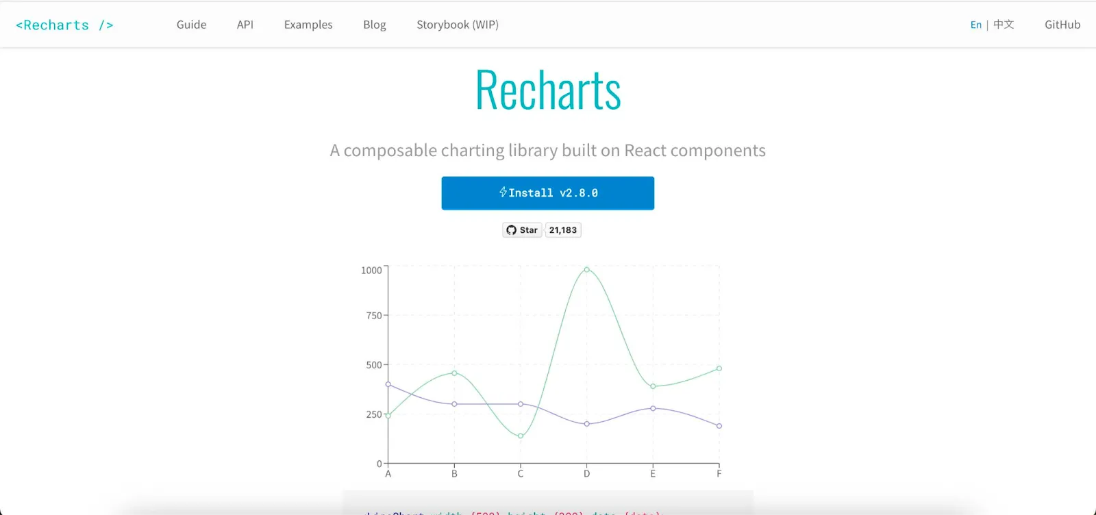
Recharts - for fans of React
Recharts is a composable chart library built on top of React components. To build charts, you can use SVG elements on top of a D3 submodule. It allows plenty of opportunities for modification, which is one of the reasons it’s used globally by companies such as Ahrefs.
While it can be a bit slow when working with large datasets, it more than makes up for it with its customization capabilities and ease of use. Its extensive TypeScript support is why Recharts is a popular choice among React developers.
Recharts is perfect for quick charting solutions in react projects, but definitely check out this piece on React chart libraries if you need more React-specific options.
October 2025 Update: Recharts continues to dominate React dashboards thanks to smooth integration and strong frontend performance. The source code is well-documented, and the github page stays active with community-driven fixes. While heavy data sets can still slow rendering, its customizable components and predictable props make it a top pick for React developers.
Highcharts - the best for enterprise apps
Highcharts lets you create charts in SVG and then convert them to VML. While their motto is “simply visualize”, the dashboards don’t look as impressive compared to some other contenders. However, the backward compatibility with older Internet Explorer versions as well as the wide variety of demos make it an interesting choice.
If you want a middle ground between D3.js and Chart.js, Highcharts is great. It’s feature-rich, yet not insanely complex to use. They also have a very rich documentation library that can help you get started rapidly.
Highcharts isn’t free like some of the other tools here, but if you’re in need of polished visualizations for enterprise apps, it could be worth the cost.
October 2025 Update: The Highcharts library stays ahead for enterprise analytics, especially for financial data visualization. Its plugin system and AI-powered insights give teams a refined way of presenting metrics. Though not free, many developers still use Highcharts for its reliability, compliance, and long-term support in corporate web development.

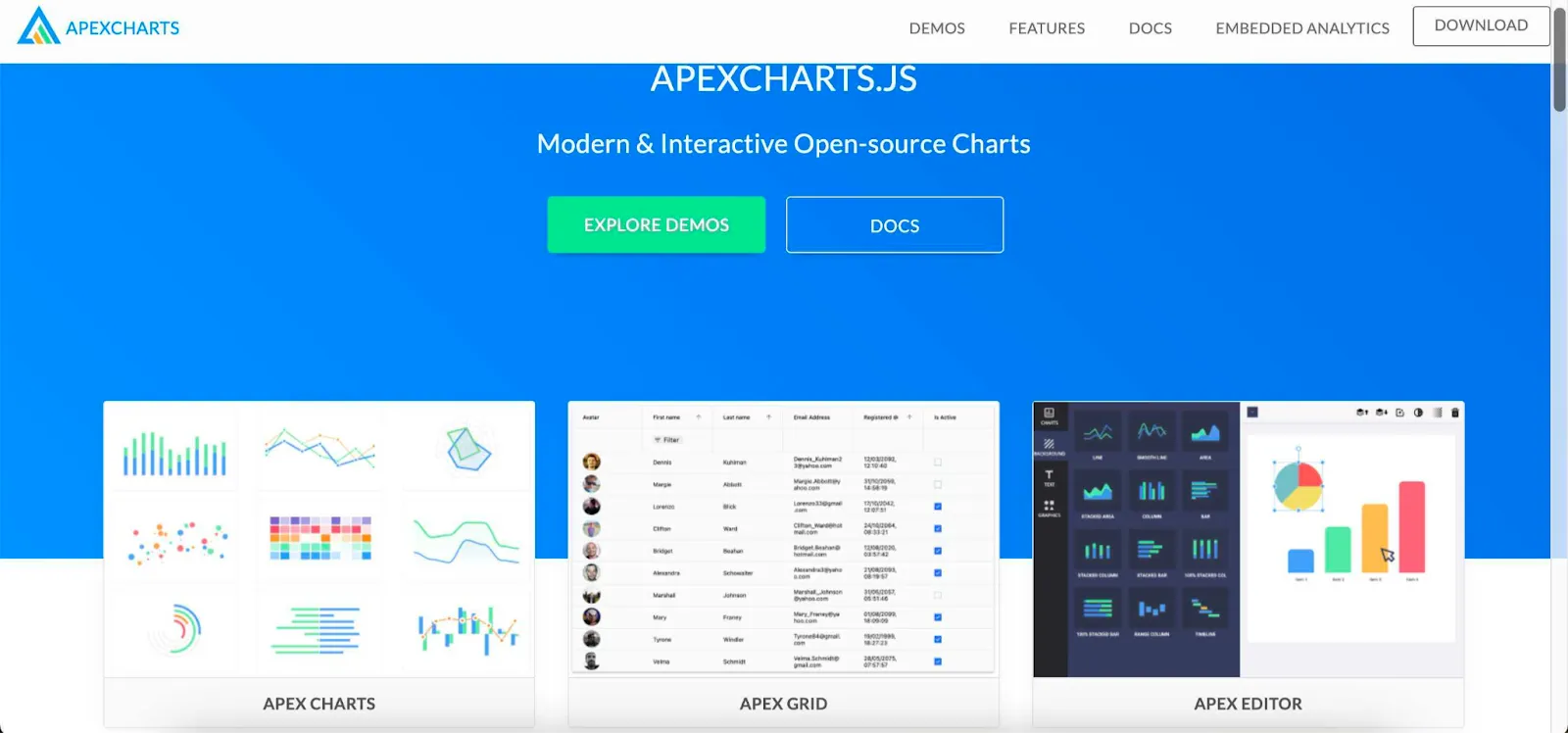
Apexcharts - for open-source charts with annotations
Looking for something that is open-source, easy to use, has beautiful visualizations and allows annotations? Apexcharts has you covered. According to their documentation, this JS library supports all charting features, including annotations, which are not so common among its competitors.
Besides charts, Apexcharts has a separate product called Reveal, which allows you to do embedded analytics and add charts into your website or product. Apexcharts supports Angular, Vue, React and other frameworks.
October 2025 Update: ApexCharts keeps expanding its capabilities with smoother transitions and better framework wrappers. It’s free and opensource, supports real-time updates, and works seamlessly across types of charts. The annotation feature remains a standout, helping devs add detailed context to their data sets in dashboards and fintech products.
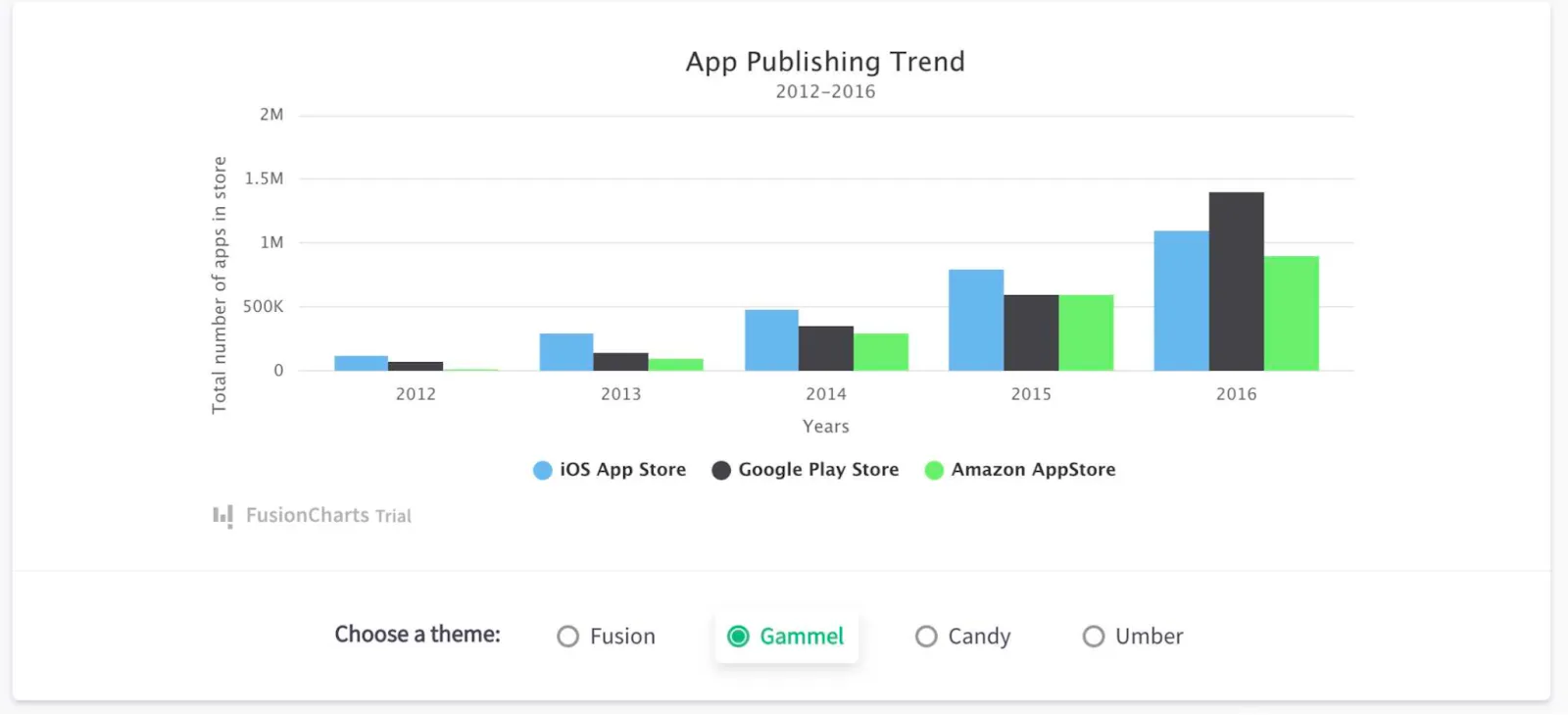
Fusioncharts - the best for data visualization
There is a total of 90 charts that you can use in Fusioncharts, making it the most comprehensive option out there. Besides charts, you can also create dashboards and both look stunning, with interactive animations for the end user.
It supports jQuery, Angular, Django, React, PHP, Net, Ruby and many other types of frameworks.
Fusioncharts work and look great across different devices. All of this comes at a minimum price of $439/year which may be worth it if you need a great variety of visualizations across devices.
October 2025 Update: FusionCharts continues to push premium charting libraries available with new html5 charts and accessibility improvements. While commercial, its professional polish, tooltip customization, and responsive layout make it a strong competitor for clients who need cross-device dashboards and financial data clarity.
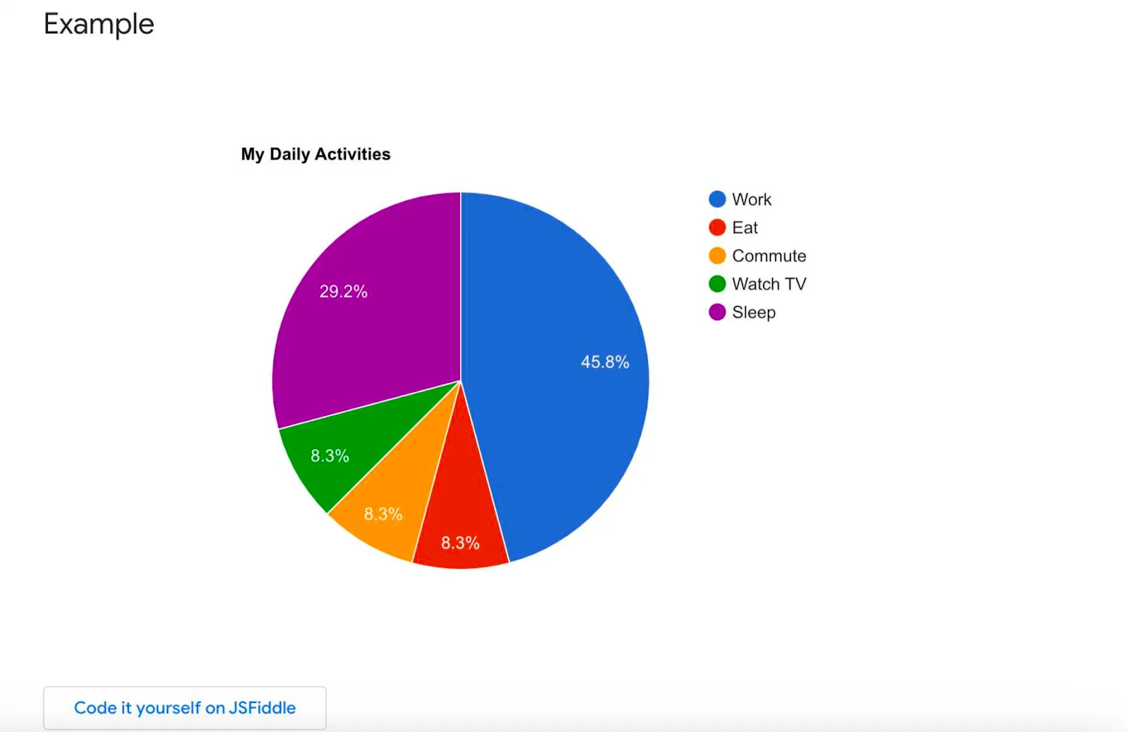
Google Charts - for a large variety of chart types
If you’re a fan of the Google ecosystem and you’re looking for something free, Google Charts fits the bill perfectly. It supports a good variety of data visualization formats, including scatter plots, geo charts, pie charts, calendar charts, and others. The visualizations look great across different devices and they are rendered using HTML5/SVG.
You can use Google Charts to create bar charts, Gantt charts, donut charts, scatter plots, maps and many other chart types. We wouldn’t use it for enterprise-grade apps, but for a simple lightweight app, it works just fine!
October 2025 Update: Google Charts remains stable and free, but modern tools now overshadow it. It’s still useful for web designers experimenting with different types of charts or building quick demos. The interface feels dated, yet its simplicity and easy to implement setup make it good for teaching or quick concept testing.
ECharts - for high-performant charts
If fast-loading charts are important to you, ECharts is a great contender. They support both HTML5 canvas rendering and SVG, making it possible to render large amounts of data in realtime.
This makes it a great library for advanced analytics use cases, like real-time data monitoring or visualizing time series data. It’s highly compatible with JSON data, and offers a Python wrapper too, which makes it a versatile solution.
October 2025 Update: Apache ECharts keeps leading the pack for data sets in IoT and logistics. Its hybrid rendering with WebGL, SVG, and Canvas gives smooth performance even at millions of points. Advanced interactivity, zoom control, and layout options make it one of the most powerful charting libraries available for high-frequency visual monitoring.
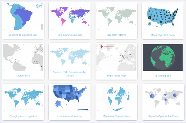
amCharts - best for map visualizations
If you need to visualize geographical data, amCharts is worth checking out. They’ve bundled hundreds of country and regional maps to choose from, both in high and low detail. Their website offers a bunch of interactive demos to browse through.
October 2025 Update: amCharts is still loved for global web development projects, especially for mapping and geodata dashboards. With regular updates and rich APIs, it’s customizable and easy to extend with plugin options. While it’s not open-source, it remains one of the best libraries available in the market for interactive geographic visuals.
Chartist - for simple, responsive charts
Chartist is a great option if you’re looking for simple charts with plenty of customization options. What we like most is their animation and transition features: you can apply CSS animations to your SVG-based charts. With media queries, you can make charts look good on any device, whether it’s Windows, iOS or Android.
October 2025 Update: Chartist continues as a minimal, free and open source tool favored by hobbyists and small dev teams. Its simple API makes it easy to implement, and the CSS-driven animations give great control over transitions. Still, many libraries would choose newer options like ApexCharts for production-grade dashboards.
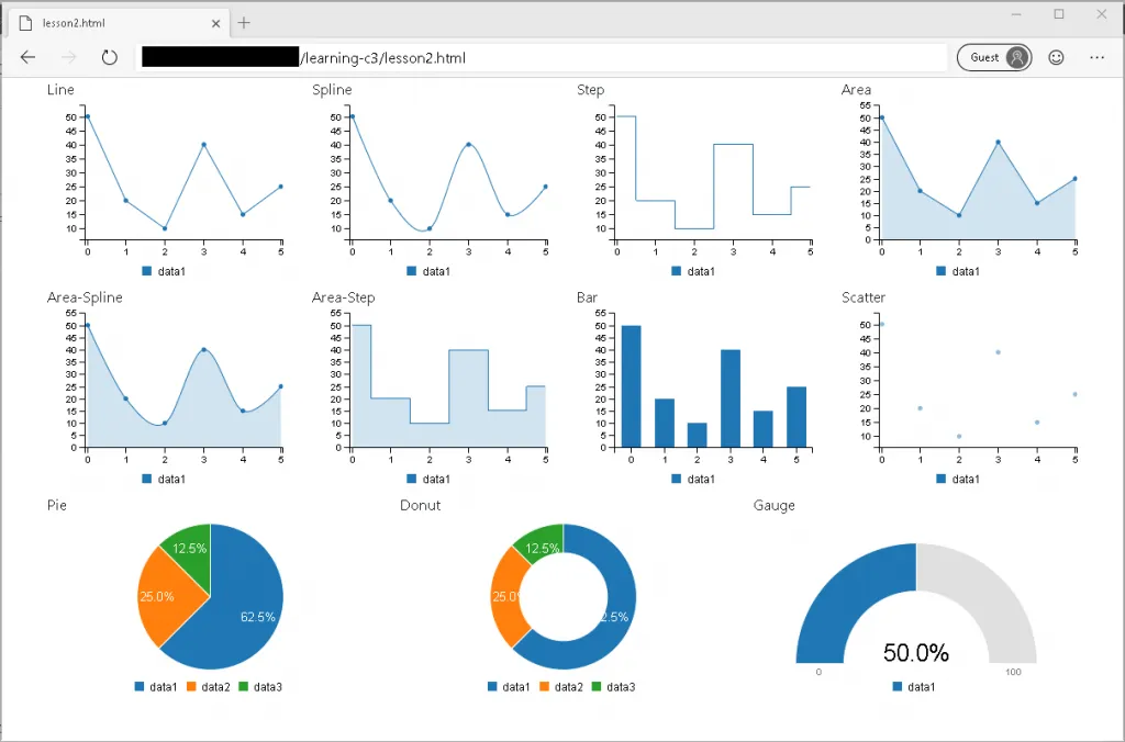
C3.js - a simpler, lightweight version of D3.js
If you want to leverage the power of D3.js, but you don’t want to go through the learning curve, have a look at C3.js. This API built on top of D3.js makes it easier to create charts without having to write D3 code. However, it is definitely on the simplistic side, lacking deeper functionality that other tools on this list do offer.
October 2025 Update: C3.js remains stable but mostly used for legacy projects. It’s customizable to a point and fine for small data sets, but modern tools like Plotly JavaScript or LightningChart JS handle complexity better. If you need something light, C3 still works — but check AnyChart or ZingChart for richer visuals and active development.
4 reasons why you shouldn’t use JS chart libraries in 2026
Even though they are commonly used in development teams of all sizes, pure JavaScript libraries are not ideal for everyone - and here’s why.
1. Too much coding, even with modern frameworks
Libraries like D3.js or ECharts give you full control, but everything still has to be coded by hand. Even with wrappers like Recharts or react-chartjs-2, you need experienced developers to maintain and customize them. In 2026, product teams are asking: why spend weeks coding charts when AI-powered tools can generate them from plain English prompts?
2. Slow to ship new data products
Chart libraries depend on fully prepped datasets. That means you can’t build until your pipelines are ready, which often adds weeks of setup time. Today’s embedded analytics platforms, backed by GPT-5 and AI agents, let teams connect data and spin up visualizations in hours instead of months.
3. Limited experience for end users
Most JavaScript libraries can show charts, but they don’t handle real-world user expectations: multi-language support, role-based access control, or dynamic personalization. In fact, data in 2025 shows that 42% of SaaS users want more interactivity and 38% expect personalized dashboards - needs that libraries alone don’t meet.
4. Poor fit for validating product ideas
Spending weeks coding chart libraries to test a feature is risky. If customers don’t engage, you’ve wasted time and money. In contrast, modern embedded analytics and AI visualization tools let teams prototype dashboards in hours and validate with real users quickly. This makes them a safer bet when testing whether customers actually care about your insights.
Alternatives to JavaScript chart libraries
1. Embedded analytics tools
If your team doesn’t have time or experience to build complex dashboards from scratch, embedded analytics tools are the smarter alternative to traditional charting libraries. With drag-and-drop interfaces and ready-made visual components, you can build polished data experiences faster and with far less code.
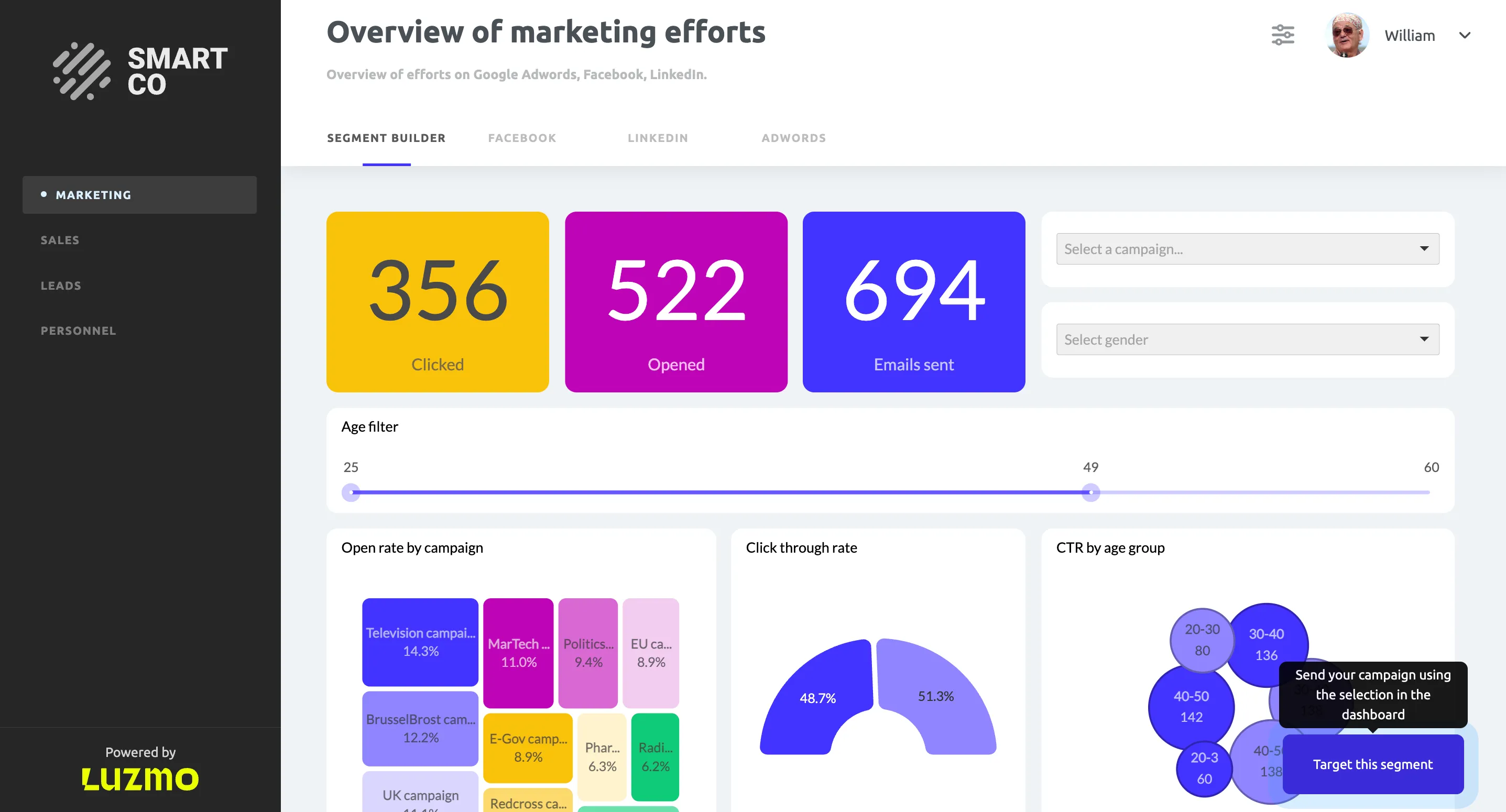
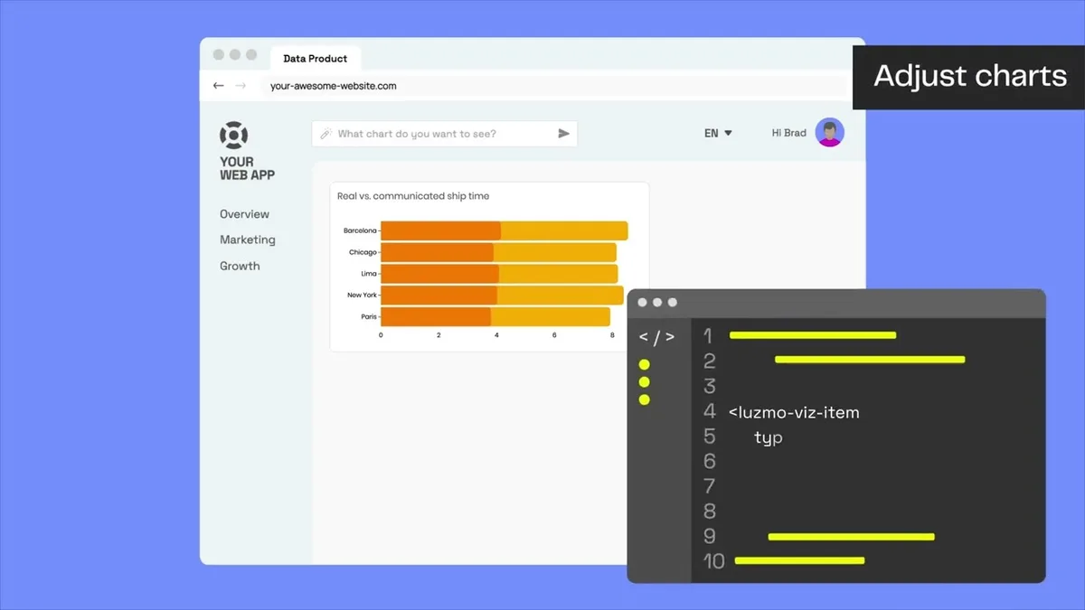
For quick prototyping or MVP validation, tools like Luzmo Studio are ideal. You can design dashboards in hours, not weeks. It's perfect for product managers who need to visualize data, test ideas, or gather early user feedback without relying on developers.
And don’t mistake simplicity for limitation. Modern embedded analytics tools now support multi-language dashboards, interactive filtering, and secure access control, giving you both speed and flexibility. If you want to launch analytics that feel native to your product, without the overhead of maintaining a chart library, this is where to start.
2. Luzmo Flex
Charting libraries give full freedom but they’re slow and hard to scale. No-code analytics tools are fast but they can feel restrictive for technical teams. Luzmo Flex bridges that gap.
It’s a software development kit (SDK) that lets you code custom analytics experiences directly inside your app while keeping the speed of drag-and-drop building. With Flex, you can start with a prototype and gradually extend it with code, from tweaking visuals to building an AI-powered data analyst.
Product managers love the fast time to market, while developers appreciate the programmatic control and advanced Query Engine that handles heavy data lifting. Behind the scenes, Luzmo’s automation manages data connections, caching, and security, so teams can focus on building innovative products instead of backend orchestration.
Flex also supports real-time data, localization, and responsive layouts for any platform: from web apps to embedded dashboards.
Popular examples built with Flex include:
- Report builder: lets end users create custom reports from their own datasets.
- AI chart generator: builds charts on the fly from natural-language questions.
- Personal health tracker: delivers personalized insights per user profile.
- Custom chart library: gives your customers a full library of charts to build dashboards themselves.
As Sarah Nerby from Element Logic puts it:
““Luzmo Flex has empowered us to go beyond the constraints of traditional dashboards, allowing us to easily create custom data analytics with unprecedented flexibility. This advancement has streamlined the process from design planning to development, enhanced consistency across our application, and minimized the risk of human errors.”
3. Luzmo Flex
Do you need a smarter analytics experience for your users? Luzmo IQ brings AI-powered insights directly into your app.
It lets users ask data questions in plain language and get instant answers backed by charts, summaries, or visual explanations. You can embed IQ as a chat widget, integrate it with your product’s search, or connect it through APIs to tools like Slack.
Behind the scenes, Luzmo IQ uses secure data handling, real-time query engines, and feedback loops that improve answer accuracy over time. None of your data is used for AI model training, ensuring full privacy and SOC 2 / GDPR compliance.
It’s perfect for SaaS teams that want to turn any user into an analyst, without training or complex UI.
Which path should you take?
Building data visualizations with your own team can seem like the only path you can take. However, there is always a choice and you don’t have to resort to using Javascript chart libraries.
Sign up for a free trial of Luzmo and try out a faster alternative to Javascript libraries without compromising on functionality. Save time and money, while giving your users real-time insights to make data-driven decisions!
FAQ
All your questions answered.
What is the best JavaScript chart library for beginners?
For beginners, libraries like Chart.js are often the easiest starting point because they provide simple APIs, good documentation, and quick setup. More advanced libraries like D3.js offer far greater flexibility but come with a much steeper learning curve and require deeper knowledge of JavaScript and data visualization concepts.
Are JavaScript chart libraries still relevant for modern applications?
Yes, JavaScript chart libraries are still widely used for building custom data visualizations inside web applications. However, many teams are now combining them with embedded analytics platforms or AI-powered tools to reduce development time and provide richer data experiences such as interactive dashboards, role-based access, and natural-language data exploration.
When should you use an embedded analytics tool instead of a chart library?
You should consider an embedded analytics platform when you need full dashboards, user permissions, interactive filtering, or faster deployment. Chart libraries are best when developers need complete control over visualization logic, while embedded analytics tools are better for quickly delivering production-ready analytics features inside applications.
Written by

Ship the future of your data
Let us show you what Luzmo can do for your product.

Leave your e-mail and one of our analytics experts will reach out to you