 ChatGPT
 Perplexity


Build your first embedded data product now. Talk to our product experts for a guided demo or get your hands dirty with a free 10-day trial.

In 2007, Apple launched the iPhone. Other phone manufacturers such as Nokia and Blackberry scoffed at the idea of a phone with a touchscreen and thought the phone would never be a success. However, Steve Jobs had all the information at the time, and with the success of the iPod, the launch was a no-brainer. The rest is history.
Having access to the most important data can lead to strategic decisions. And when that data is interactive and the end-user can explore it, the insights can be groundbreaking. This is what interactive dashboards are for.
Today, we explain what an interactive dashboard is, how it works and why you should consider using them in your business.
An interactive dashboard is a live document with data points, usually visualized through graphs, charts, and widgets. The “interactive” part comes from the fact that end users can interact with the dashboard and explore their data.
For example, they can change the timeframe, drill down into specific metrics they’re interested in and get detailed insights about specific data points.

For example, a sales manager can open a general sales dashboard and then go into a bar chart with individual sales reps. They can then find out who the most successful rep is, with the highest number of closed deals. Then they can drill down into data some more to find the individual sales and their average value.
When you create dynamic, interactive dashboards, the end-users have the opportunity to view more than static data. Through data visualization, they can explore a certain dataset and unearth the KPIs that interest them. Here are the practical benefits of this dashboard type.
Improved decision-making: anyone in your team can do their own data analysis and find the key performance indicators that interest them. Analyzing and interpreting data is no longer reserved only for the tech-savvy members of your team.
With visual clarity, it’s much easier to understand changes in trends, forecast future performance and improve operational efficiency. Instead of looking at raw data, business users can look at various graphs and chart types that provide a wealth of information in one glance, compared to spreadsheets and tables.
With dashboard design elements such as tooltips and text boxes, your data engineering team can add instructions on how non-technical users can interact with and interpret interactive visualizations.

Access to real-time data: stakeholders across your team can just open a dashboard link and get access to key metrics refreshed in real-time. They no longer have to wait for data engineers to create weekly, monthly or quarterly dashboards to get insights.
Modern dashboard tools are also device-agnostic. This means you can access business intelligence data on desktop, mobile, tablet or any device with internet access.
Better communication and collaboration: different teams get access to the same datasets from the same data sources. For example, marketing and sales can get access to one dashboard and each department can do interactive data exploration to come up with different KPIs and results. This way, a single BI dashboard can facilitate better communication across teams.
Performance monitoring and management: with user-friendly dashboards, individual teams can keep track of their key performance indicators over time. They can make data-driven decisions in real time instead of waiting for data analysts to create and customize dashboards for them.
You can take things to the next level by setting up notifications for certain KPI values. For example, if your user churn drops below a certain threshold, the sales and customer success teams get notified.
More flexibility and adaptability: instead of static dashboards with fixed elements, your team and end-users can benefit from drag-and-drop dashboard builders and editors. Interactive charts and graphs are simpler to use than Microsoft Excel, without compromising on the quality of insights.
Self-service analytics allow the average user to do things such as data forecasting. With modern dashboard software, you can achieve true data democratization and allow anyone to benefit from interactive features in dashboards.
There are many types of dashboard tools to choose from: Power BI, Tableau, Qlik and others. If you’re considering your next dashboard tool with interactive features, make sure it has these key features.
Make sure your chosen data analytics and dashboarding tool fetches data from your data sources in real time. For example, a financial dashboard should have the most up-to-date metrics at the time of viewing it, so a CFO can make critical decisions in the blink of an eye.
It’s also useful if multiple team members can collaborate on a dashboard together and leave comments and thoughts for everyone to see.
The end user should be able to customize the dashboard to their liking. Moving dashboard elements and widgets to certain spots, changing dimensions, changing visualization types, and more.
Last but not least, if you have an embedded analytics dashboard, it should fit in well with the rest of your application. Your end-users want to have a seamless experience, so make sure the look and feel of their dashboard matches its surroundings.
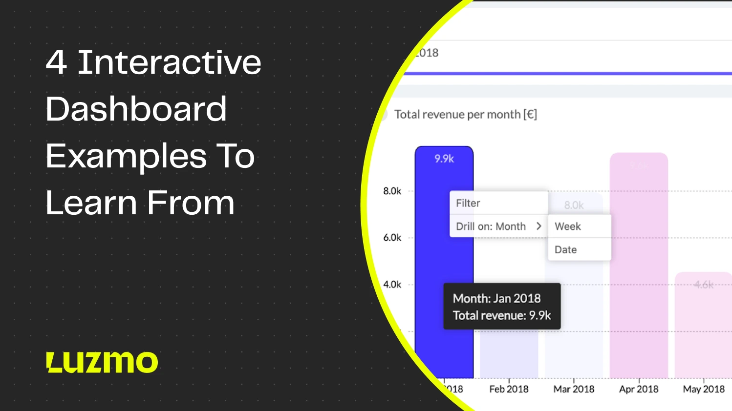
A dashboard isn’t meant to be static. The end-user should be able to freely click around items and widgets to find the data they need. For example, they should be able to click through pie charts and find out what different slices mean and what the data looks like behind them.
You can achieve this with features such as tooltips, which are instructions on what a piece of data is and how it can be explored. Drilldowns and drillthroughs are another great example. For example, in an email marketing dashboard, you could click through on the name of a specific subscriber and see a detailed dashboard with specific email stats for that person.
Artificial intelligence and language learning models have broken their way into the world of BI. Modern dashboarding tools like Luzmo come with AI out of the box. For example, you can use our AI chart generator to feed data to Luzmo and it will generate the best chart for your desired use case.

In some cases, you may want to ask for more specific recommendations. Besides Luzmo’s recommended charts, you can also use a prompt to ask for specific insights. This is the most common way you’ll see AI being offered in other modern BI tools, however, keep in mind that those use cases have a long way to go before they become fully usable in some tools.
Want to get inspired with some of the best uses for interactive dashboards? Here are our top picks.
Sentiance is a mobility and motion insights company that needed dashboards with real time insights about their drivers. How many trips they make, where they are located, how safely they are driving and more.

The end users of the app can drill down into data and explore the driving habits of every single drive, to the level of individual trips.
Kenjo is a human resources SaaS app used by thousands of businesses globally. Those businesses wanted a good way to show the multitude of HR metrics they track and measure every day. This was the result:

Kenjo users can now generate and explore their own dashboards instead of asking the IT team to create a dashboard every time they have a question.
Spaceflow is a SaaS product for landlords who want to provide a superior tenant experience. They need a dashboard that shows key real estate information in one place: which apartments are occupied and when, which areas tend to be good for investment, which apartments are not booked to full capacity, etc.

Thanks to dashboards such as this one, dashboard requests from users dropped by 80% - since the end-users could now access their own, pre-built dashboards and explore them.

Example of the chart picker


Example of the individual player stats (you can get here by clicking on a player in the donut chart on the previous screenshot)
In 2024, there is no excuse for any dashboard not to be interactive. Today’s business users expect insights immediately and an interactive dashboard does just that. There is nothing to lose, and massive benefits to gain: faster decision-making, empowering every user in your team with data, improving collaboration across departments and more.
And if you want to empower your end-users with interactive dashboards in your software product, Luzmo ticks all the boxes. A wide variety of data sources, fast and efficient API, easy embedding, lots of visualization choices - we could go on for hours.
But why not have someone from our team show it all in action? Book a free demo with us to find out how your app users can benefit from interactive dashboards.

Build your first embedded data product now. Talk to our product experts for a guided demo or get your hands dirty with a free 10-day trial.


