
.png)
Build your first embedded data product now. Talk to our product experts for a guided demo or get your hands dirty with a free 10-day trial.


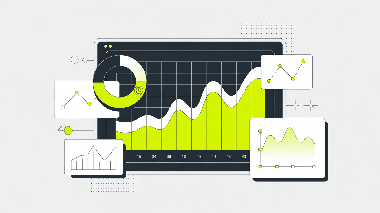
Data visualization is a must-have, but building custom charts is a time sink for your dev team.
Charts make data easier to understand. They tell stories, highlight trends, and help users make better decisions. But not every dataset fits neatly into bar charts, pie charts, or a standard line chart. Sometimes, you need something more specific—a radar chart to track performance, a scatter chart for detailed comparisons, or a custom visualization that standard chart templates just don’t cover.
That’s where the challenge begins.
Off-the-shelf charting tools? They’re fast, but rigid. If they don’t support the chart type you need, you’re stuck.
Building from scratch? It’s flexible, but expensive. Your developers spend weeks writing custom code, fine-tuning every data point, and handling performance issues—just to get a single interactive chart working.
The trade-off between flexibility and development time has always been a problem. Luzmo’s custom charts change that. Instead of choosing between limited tools or heavy dev work, you can create charts that fit your needs while keeping things simple. Mix standard data charts with your own visualizations. Add a chart title, tweak a donut chart, or integrate a fully custom-built solution—all without starting from scratch.
With Luzmo, you get the best of both worlds: the customization you need without draining your resources.
Custom charts sound great—until you start building them. The development time adds up fast. Your frontend team spends weeks fine-tuning the chart design, while backend engineers handle data processing and performance tuning. And even after launch, ongoing updates keep pulling resources away from other priorities.
On the flip side, off-the-shelf solutions are quick to set up, but they lock you into preset templates. Need something beyond basic options? Tough luck. Your team is stuck choosing between a rigid chart creator that lacks flexibility or a fully custom build that drains time and budget.
Luzmo’s hybrid approach makes room for both. You get the customization of building from scratch without the heavy lifting. Whether you need doughnut charts, complex visuals, or beautiful custom charts that fit your brand, you can save charts with your exact specifications—no full-scale development required.

Instead of choosing between speed and control, Luzmo gives you both. You get the beautiful custom charts you need—without sinking weeks into development.
Picking the right charting solution isn’t just about looks—it’s about getting the right data charts in front of users without slowing down development. Some tools are quick to set up but don’t give you enough flexibility. Others let you customize everything but take too long to build.
So, what really matters when choosing a chart creator for your product?
✅ Customizability – Can you tweak every part of the chart? Standard bar charts and pie charts are fine, but what if you need something specific like a radar chart or a highly detailed scatter chart?
✅ Lock-in – Does it work with your app’s existing chart templates and other UI elements? A tool that forces you into a rigid system can be a headache later.
✅ Interactivity – Can users drill down into data, filter results, or adjust settings on the fly? A static line chart won’t cut it when users need real-time insights.
✅ Performance – Does it scale? A data chart that lags or slows down dashboards is useless, no matter how nice it looks.
✅ Speed/Developer Effort – How long does it take to integrate? If adding a chart title takes a full sprint, it’s not the right fit.
Luzmo takes the hassle out of choosing between speed and flexibility.

✔ Pre-built charts – Ready-to-use options like donut charts, doughnut charts, and line charts for quick implementation. We offer a library of 63 (and counting) pre-built charts
✔ Custom charts – Build exactly what you need when chart type matters.
✔ A balance between customization and speed – No trade-offs. Mix standard interactive charts with custom-built ones without getting stuck in long dev cycles.
✅ Do you need more than standard chart templates?
✅ Are you looking to create charts without long development timelines?
✅ Do you want a mix of pre-built and custom charts?
✅ Does performance matter for your users?
If you checked more than two boxes, you’re in the right place. Luzmo lets you build custom charts without the usual headaches.
Not all data fits neatly into a bar chart or a pie chart. Some industries work with complex datasets that need more than a standard chart template. That’s where custom charts come in.

Here’s where they make a real difference:
Need data charts for compliance-heavy reports? Risk exposure graphs, fraud detection visuals, and custom funnel charts are must-haves.
Standard line charts don’t cut it for tracking patient vitals. Think ECG waveform displays, genomic data visualizations, and real-time monitoring dashboards.
Heatmaps, scatter charts, and interactive charts that show traffic patterns or network connections in detail.
Decision trees, neural network maps, and AI output visualizations that help teams understand how models reach conclusions.
Real-time shipment tracking with custom maps that display movement, delays, and predicted arrival times.
Doughnut charts, radar charts, and engagement tracking tools that show how students interact with course content.
Org charts, employee lifecycle funnels, and attrition predictors that help HR teams visualize workforce trends, hiring bottlenecks, and engagement metrics.
Real-time network usage graphs, outage heatmaps, and subscriber flow diagrams that show how users move across regions, towers, and services.
Choosing the right charting setup depends on your needs:
👉 Are standard charts enough? → Use pre-built options like donut charts and classic dashboards.
👉 Do you need a special chart type that standard tools don’t support? → Go with custom charts for full flexibility.
👉 Do you want a mix of both? → Luzmo’s hybrid model lets you combine pre-built and custom options without extra dev work.
No matter the use case, having the right chart creator makes data more useful. Luzmo gives you the flexibility to work with what you have—or build exactly what you need.
We’ve covered the full technical walkthrough in our Academy guide — from setup to integration tips and best practices.
📖 Read the full implementation guide →

Build your first embedded data product now. Talk to our product experts for a guided demo or get your hands dirty with a free 10-day trial.


