Best Embedded Analytics Tools for SaaS Teams (2026)

Choosing an embedded analytics tool decides how your customers experience data inside your product, and the wrong pick is expensive to undo. Many of the guides ranking for this search judge these tools as internal BI, by chart types and dashboard polish. The questions that settle it for a product team are different: how the tool embeds, how it isolates each customer's data, and how it prices as you grow. This guide compares 15 embedded analytics tools through that lens, so you can shortlist the few that fit how you ship.
What are embedded analytics tools?
Embedded analytics tools are software products that integrate customer-facing dashboards, reports, and data visualizations directly inside another company's application, for that application's own end users. These tools turn your product's data into something your customers act on, not internal reporting your analysts read.
For a product team, the decision comes down to build or buy. Building an embedded analytics layer in-house means months of engineering on multi-tenancy, security, and a charting stack you then own for years. Buying one means shipping in days and spending that roadmap capacity on your core product instead.
If you'd like to see it working first, book a demo.
What to look for in embedded analytics tools
The two criteria that decide many embedded analytics shortlists are the embedding method and multi-tenancy, so weigh those before anything else. Everything below matters, but these two settle if a tool can ship a secure, native experience to your customers at all.
Embedding method (native SDK vs iframe). This is how the analytics layer lands in your product. A native SDK or web component renders inside your DOM, so dashboards inherit your design system. An iframe drops a sealed window into the page, isolated from your styles and harder to make feel native.
Multi-tenancy and row-level security. Your customers each see their own data and no one else's. Tools built for embedding enforce this with row-level security tied to a token or user attributes. Internal BI tools often can't isolate tenant data safely, and need a separate deployment per customer to do it. Look for SOC 2 and GDPR compliance here too, since your customers' security teams will ask.
Pricing model. Embedded usage scales with your customer base, so the model decides if costs stay predictable. Seat-based pricing punishes growth, usage or consumption pricing creates surprise invoices, and platform or MAU pricing tracks adoption more evenly. Check each vendor's own pricing before you shortlist.
Data sources. The tool connects to where your data already lives, from a warehouse like Snowflake to a transactional database to an API.
Performance. Dashboards stay fast for end users at scale, through caching, query optimization, or a purpose-built engine.
Self-service. Your customers, and your own non-technical team, build and edit dashboards and skip the engineering ticket.
Customization. The output matches your brand, from theming and white-labeling to control over individual components.
The embedding method shapes so much of the rest that it deserves its own section.
iframe vs SDK embedding: why the architecture choice matters
The embedding method decides if your analytics feel native or bolted on, and a native SDK beats an iframe on both design and security. An iframe loads your dashboards in an isolated frame that can't inherit your application's fonts, colors, or components, so it always reads as a separate product wedged into yours.
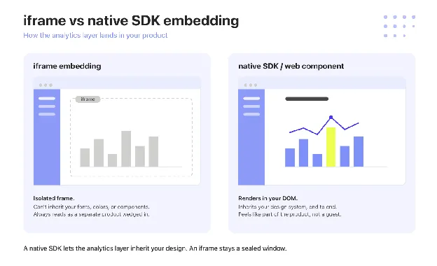
An SDK or web component renders in your own DOM. You apply your design system to every element, pass user context for row-level security cleanly, and treat the analytics layer as part of the product, not a guest inside it. The practical test is simple: can you restyle every element of a chart with your own CSS, or are you stuck with whatever the frame gives you.
This is where component-level embedding earns its place. For a deeper look at the trade-offs, see iframe vs web component.
Want to see native embedding in a live product? See how it works.
The best embedded analytics tools for SaaS teams in 2026
The embedded analytics software in this guide spans 15 tools, grouped by the buyer they fit best, from SaaS and white-label specialists through enterprise and governed platforms to open-source options. Start with the group that matches your team, then use the comparison table further down to narrow the shortlist.
SaaS and white-label
Luzmo
Luzmo, the embedded analytics infrastructure for product teams, gives SaaS companies the plumbing to ship customer-facing dashboards inside their own product and turn them into a revenue line.
Luzmo embeds through native SDK and web components, not an iframe, so every chart renders in your DOM and inherits your application's fonts, colors, and components. Luzmo Flex takes this to the component level, letting engineers compose dashboards from individual building blocks. Full white-labeling means the analytics layer carries your brand, with no Luzmo logo on the customer's screen.
Multi-tenancy runs on row-level security through JWTs and user attributes, so each customer sees only their own data, with no separate deployment per tenant. Luzmo holds SOC 2 and GDPR compliance, the trust signals an embedded rollout's security review asks for. Non-technical users build and edit dashboards in Luzmo Studio, so true self-service doesn't route every request back through engineering.
Pricing scales on Monthly Active Users, with no per-user pricing on the viewer side, keeping costs predictable as your customer base grows. Luzmo IQ adds agentic AI grounded in a real query engine, so end users ask questions in plain language and get answers tied to governed data, not free-form SQL a model invents.
Luzmo is best for growth-stage SaaS product teams shipping customer-facing analytics in days. As Maarten Saeys, CPO at Lansweeper, put it after migrating: "Skipped three years of development time. NPS through the roof." You can read the full customer story or start building for free.
Qrvey
Qrvey is an embedded analytics platform built specifically for multi-tenant SaaS, with a built-in data lake instead of a connection to your warehouse. It delivers dashboards, self-service reporting, and data-driven workflow automation as a full-stack package you self-host in your own cloud, so customer data never leaves your environment.
Qrvey embeds through SDK components and runs tenant isolation through its multi-tenant architecture, which is the center of its pitch, not an add-on. Its AI layer covers agentic analytics and governance built into the same stack.
On pricing, Qrvey takes a flat-rate platform approach and added a perpetual-license option in 2026, both designed to keep costs predictable as customers, data, and usage scale, instead of metering per user. Figures aren't published, so pricing is sales-led.
Qrvey is best when multi-tenancy is the core of your problem and you want a full-stack analytics layer, not a lightweight embed. It's a larger platform decision than a drop-in component, which is the point for teams treating analytics as core infrastructure.
Developer-first
Embeddable
Embeddable is a developer-first platform built for teams that want the analytics layer to feel fully native and are willing to own more of the implementation. It gives front-end engineers component-level control over how dashboards render, behave, and connect to your data model.
Embeddable embeds through native components, not an iframe, so the output reads as part of the product, and it supports multi-tenant deployments. Its pricing is a flat-fee platform model, sales-led, not published, which keeps costs steady as your customer base grows instead of metering per viewer.
The trade-off is ownership: you get more control over modeling, components, and product behavior, and in exchange you own more of the implementation detail than a turnkey tool asks for.
Embeddable is best for product-led teams with front-end engineering capacity who want analytics that feels indistinguishable from the rest of the app and are comfortable owning the build.
Holistics
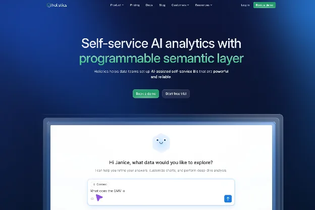
Holistics is a SQL-first analytics platform for data teams who model in code and want embedding as an extension of that workflow. It offers SDK and iframe embedding options and enforces multi-tenancy through its permission model. Pricing is published in tiers and leans per-seat, so model the cost against your viewer count before committing. Holistics is best for SQL-first data teams who value a code-based modeling layer over a drag-and-drop builder.
Enterprise and governed
Omni
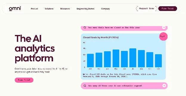
Omni is a business intelligence and embedded analytics platform with a built-in semantic layer, founded by an ex-Looker team and now backed by a large 2026 raise. It acquired Explo in late 2025 to extend into customer-facing use cases, so the Explo product folds into Omni over a migration window. Omni leads its own positioning with "governed embedded analytics with AI."
Omni embeds through SDK and iframe options and is warehouse-first, with tenant consistency enforced through its semantic layer. Its AI grounds in that governed model, which is its central claim. Pricing is sales-led and custom.
Here's the honest contrast for a product team. Omni grounds its AI in a semantic layer your data team builds and maintains, which is a real strength for organizations with a data-engineering center of gravity and a warehouse-first stack. Luzmo IQ grounds AI in a query engine inside the customer-facing product itself, and Luzmo ships with no warehouse-first foundation required. Both ground their AI; the difference is where the grounding lives and who maintains it.
Omni is best for teams whose analytics center of gravity already lives in the data warehouse and the semantic layer.
GoodData.AI
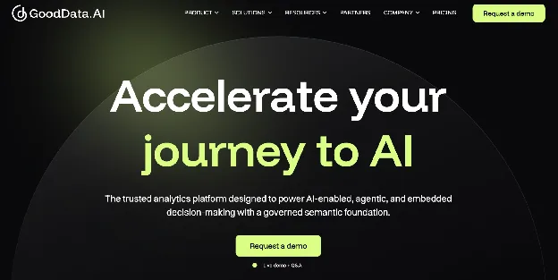
GoodData.AI (rebranded from GoodData in April 2026) is an enterprise platform now positioned as "AI-native decision intelligence", not embedded analytics. It embeds through an API-first, OEM model with strong multi-tenant support, and its differentiation is a governed semantic layer feeding AI agents and an MCP server. Pricing is sales-led and custom. GoodData.AI is best for enterprises that want governed, semantic-layer analytics and are comfortable with custom procurement.
Looker
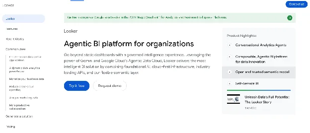
Looker is Google Cloud's BI platform, embeddable through its SDK and iframe options and modeled in LookML. Row-level security flows from the LookML model, and its AI is Gemini-assisted. Pricing is sales-led through Google Cloud. Looker is best for teams already standardized on Google Cloud with LookML expertise in-house, where the modeling investment pays off twice.
Power BI Embedded
Power BI Embedded is Microsoft's version of Power BI for embedding analytics in external apps. It embeds through capacity and APIs and enforces row-level security. On AI, note the nuance: Copilot is a Power BI/Fabric feature and, as of the 2025 release, does not extend to the Power BI Embedded (app-owns-data) experience your customers see. Pricing is capacity-based, billed through Azure capacity tiers, not per user, which is a platform fee model. Power BI Embedded is best for teams already invested in the Microsoft and Azure stack.
Tableau
Tableau is a BI-first platform that many teams reach for to embed external dashboards because of its visualization depth. It embeds through an iframe or the Embedding API, supports row-level security, and adds Tableau AI and Pulse. Pricing is per-seat and sales-led, which grows fast when you extend it to a large external user base. Tableau is best for BI-first organizations adding embedding onto an existing Tableau investment.
Sisense
Sisense is an enterprise analytics platform built to process large, complex datasets. It embeds through its Compose SDK or iframe, supports multi-tenant deployments, and offers an AI assistant for natural-language queries. Pricing is sales-led and custom. Sisense is best for enterprise teams that need heavy data processing and have the infrastructure to run a custom embed.
ThoughtSpot
ThoughtSpot is a search- and AI-led analytics platform, embeddable through its Visual Embed SDK with row-level security and the Spotter agentic agent. Its embedded pricing is consumption-based, charged against query and dashboard activity, which makes long-term cost hard to predict for an active customer base. ThoughtSpot is best for teams that want search- and AI-driven analytics and can model consumption carefully.
Domo
Domo is an all-in-one cloud platform spanning data integration, BI, and apps. It embeds through APIs and iframes, supports multi-tenancy through personalized data permissions, and brings Domo.AI agents. Pricing is consumption and credit-based and sales-led, so model the consumption curve before you commit. Domo is best for organizations that want data integration and BI in one platform.
Yellowfin
Yellowfin is an embedded BI platform known for automated and assisted insights. It embeds through an SDK and iframe, supports multi-tenant deployments, and leans on its automated-insights AI to flag changes in the data. Pricing is sales-led. Yellowfin is best for teams that want embedded BI with strong automated narrative and alerting.
Sigma
Sigma is a cloud-warehouse-native analytics platform with a spreadsheet-style interface. It embeds through an SDK and iframe, runs row- and column-level security, and offers Sigma AI for natural-language exploration. Pricing is sales-led and custom, with consumption under the hood. Sigma is best for teams standardized on a cloud warehouse like Snowflake or Databricks who want analytics modeled close to the data.
Self-hostable and open-source
Metabase
Metabase is one of the most widely used open-source BI tools, free to self-host and popular for internal reporting. It embeds through an iframe or SDK and isolates tenants through data sandboxing on its paid tiers. Pricing is open-source free for self-hosting, then per-seat on Pro and Enterprise, which can pinch SaaS teams with large external user bases. Metabase is best for internal BI teams adding lightweight embedding, not a full customer-facing product.
At-a-glance comparison
The table below lines up all 15 tools on the decision axes a product team actually weighs: how they embed, how they isolate tenants, how they price, what their AI layer does, and who they fit. The pricing column shows the model type only, since many enterprise vendors quote per deal. For a direct side-by-side of embedded analytics infrastructure against named competitors, you can also compare embedded analytics tools.
| Tool | Embedding method | Multi-tenancy | Pricing model | AI layer | Best for |
|---|---|---|---|---|---|
| Luzmo | Native SDK / web components | Row-level security (JWT + user attributes) | MAU-based, no per-seat viewer fees | Luzmo IQ, agentic AI grounded in a query engine | Growth-stage SaaS product teams |
| Qrvey | SDK, self-hosted in your cloud | Built for multi-tenant SaaS | Flat-rate platform / perpetual license (sales-led) | Built-in agentic AI + governance | SaaS where tenant isolation is the core problem |
| Embeddable | Native front-end components | Multi-tenant supported | Flat-fee platform (sales-led) | AI via underlying model | Teams wanting native front-end control |
| Holistics | SDK / iframe, SQL-first | Permission-based | Published tiered (per-seat) | AI assistant | SQL-first data teams |
| Omni | SDK / iframe, warehouse-first | Isolation via semantic layer | Sales-led / custom | AI grounded in a governed semantic layer | Teams with a data-engineering center of gravity |
| GoodData.AI | API-first, OEM | Strong multi-tenant (OEM) | Sales-led / custom | AI-native decision intelligence, semantic-layer grounded | Enterprises needing governed analytics |
| Looker | Embedded SDK / iframe (LookML) | Row-level via LookML | Sales-led (Google Cloud) | Gemini-assisted | Google Cloud teams with LookML expertise |
| Power BI Embedded | Capacity / API embed | Row-level security | Capacity-based (platform fee) | Copilot (Power BI/Fabric; not in Embedded as of 2025) | Microsoft and Azure stack teams |
| Tableau | Iframe / Embedding API | Row-level security | Per-seat / sales-led | Tableau AI, Pulse | BI-first orgs adding embedding |
| Sisense | Compose SDK / iframe | Multi-tenant supported | Sales-led / custom | AI assistant (natural-language) | Enterprise embedding with custom infra |
| ThoughtSpot | Visual Embed SDK | Row-level security | Consumption-based (embedded) | Spotter agentic AI | Search/AI-led analytics; cost hard to predict at scale |
| Domo | API / iframe | Multi-tenant (data permissions) | Consumption / credit-based (sales-led) | Domo.AI agents | All-in-one data + BI orgs |
| Yellowfin | Embedded SDK / iframe | Multi-tenant supported | Sales-led | Automated-insights AI | Embedded BI with automated insights |
| Sigma | SDK / iframe, warehouse-native | Row + column-level security | Sales-led / custom | Sigma AI | Cloud-warehouse-native teams |
| Metabase | Iframe / SDK, open-source | Sandboxing (paid tiers) | Open-source free + per-seat | Metabot AI | Internal BI teams adding light embedding |
Embedded analytics vs internal BI: why the category matters
Embedded analytics and internal BI solve different problems for different buyers, and treating them as interchangeable is the most common shortlisting mistake. Internal BI serves your own analysts, who explore data to inform company decisions. Embedded analytics delivers customer-facing analytics to your customers, inside your product, where the success metric is product engagement and retention, not an internal report.
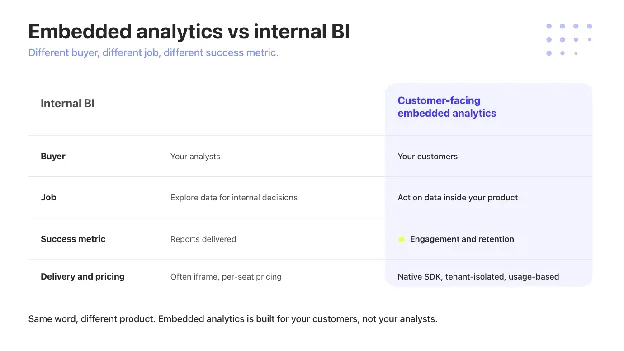
That difference shows up in the architecture. Internal BI tools embed through iframes that look bolted on, rarely isolate tenant data cleanly, and price per seat, which becomes punishing the moment every customer is a user. A tool built for embedding inverts all three, treating customer-facing delivery, tenant isolation, and usage-based cost as the default, not the exception.
The payoff is concrete. Spaceflow, a proptech platform, saw an 80% reduction in generic analytics requests after migrating off Tableau to a tool built for embedding, according to Eva Lisonova at Spaceflow. For the full definition and a deeper comparison, see what is embedded analytics.
The next category: composable and agentic embedded analytics
The next shift in embedded analytics is composable and agentic, and no ranking buyer's guide yet organizes its roster around it, even as the leading vendors start to compete on it. Composable analytics means assembling dashboards from individual, mix-and-match components instead of dropping in a fixed dashboard. Agentic analytics means AI that answers questions against governed data, not a language model improvising SQL.
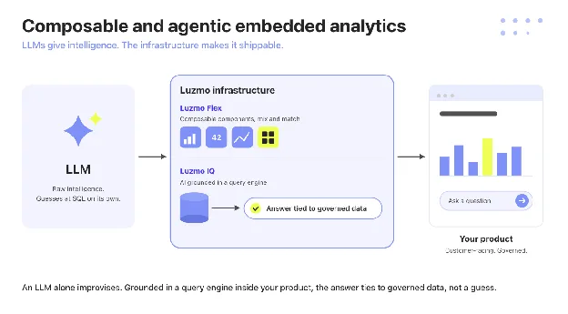
On the composable side, Luzmo Flex lets engineers build the analytics experience from discrete components that live inside the product. Luzmo IQ is the agentic side: it grounds AI in a real query engine, so an end user's question returns an answer tied to governed data, not a plausible guess that risks hallucination.
This is where the framing matters most. Some governed-analytics vendors ground their AI in a semantic layer that a data team builds and maintains, which works well when that team and that layer already exist. Luzmo grounds the same intelligence in a query engine inside the customer-facing product, so it works with no warehouse-first stack underneath it. As Cedric Spaas at Selligent / Marigold put it: "Luzmo IQ is easy to use and the results have been impressive." Kenjo reached 90% weekly adoption and launched on Luzmo IQ in five to six weeks.
Curious where AI grounding fits your roadmap? Explore agentic analytics.
Build vs buy embedded analytics in 2026
For many product teams in 2026, buying embedded analytics beats building it, because the build never really ends. Standing up your own analytics layer is a 12 to 24 month commitment to multi-tenancy, security, a charting library, and a query engine, followed by years of maintenance that competes with your core roadmap forever.
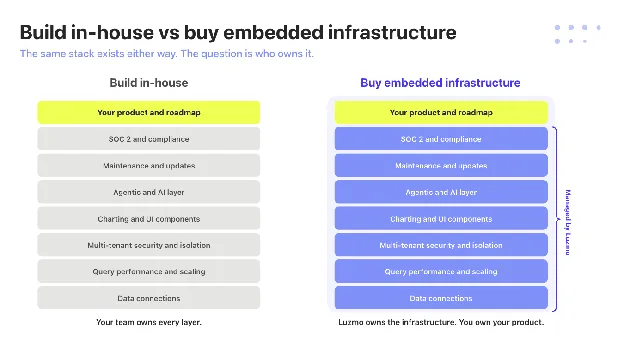
Buying converts that into a roadmap-capacity decision. You ship in days, your engineers stay on the product your customers actually pay for, and the vendor absorbs the maintenance load. Statbel, the Belgian national statistics office, put live in months a project that would have taken years in-house, with under 100 lines of integration code.
The honest version of build-vs-buy isn't "never build." It's that building only pays off when analytics is your core product, and for almost every SaaS team it's a feature that needs to exist, not the thing customers buy you for. Buying also opens a faster path to monetize embedded analytics as its own revenue line.
How to evaluate embedded analytics tools: five questions
Five pointed questions cut through a vendor demo faster than a feature checklist, because each one exposes if a tool was built for embedding or adapted to it.
- How is multi-tenancy actually implemented? Ask to see row-level security in the embed, not a slide about it.
- What does the real embed code look like? A native SDK and an iframe produce very different answers here.
- How does pricing scale at 200, 1,000, and 5,000 end users? The shape of that curve is the whole cost story.
- What happens when your data model changes? You want to know how breakage and updates propagate to live customer dashboards.
- Is AI querying available to your end users, or only to internal admins? Customer-facing agentic AI is a different capability from an internal copilot.
Run those five against any tool on the list and the embedding-first options separate quickly from the BI tools wearing an embed badge.
The bottom line
The right embedded analytics tool is the one built for the job you're hiring it for: shipping customer-facing analytics that's secure, native, and priced for growth. BI platforms can embed, but they carry the seams of a tool designed for internal analysts, while a tool built for embedding treats multi-tenancy, native rendering, and usage-based cost as the starting point.
For a SaaS product team weighing build against buy, that's the decision in one line: ship the analytics your customers want in days, and spend your engineering on the product only you can build. Book a demo to see it in your own product.
FAQ
All your questions answered.
Is embedded analytics the same as business intelligence?
No. Business intelligence serves internal analysts making company decisions, while embedded analytics delivers dashboards to your customers inside your product. They use different architectures, buyers, and success metrics, even when a single vendor sells both.
What is the best embedded analytics tool for SaaS teams?
For many SaaS product teams, the best fit is a tool built for embedding from the start, with native SDK embedding, real multi-tenancy, and usage-based pricing. Luzmo, Qrvey, and Embeddable lead that group; enterprise platforms like Looker or Tableau fit better when you're extending an existing BI investment.
How much do embedded analytics tools cost?
Pricing models vary more than the prices themselves. Expect MAU or platform-fee models from SaaS-focused tools, per-seat pricing from BI platforms, and consumption-based pricing from search- and warehouse-led tools. Enterprise vendors are mostly sales-led, so the model, not a sticker price, is what to compare.
What is the difference between embedded analytics and embedded business intelligence?
The terms overlap, but embedded business intelligence usually describes embedding a traditional BI tool, while embedded analytics describes a layer built for customer-facing delivery. The practical question is if the tool isolates tenants and prices for external scale, not which label it uses.
Is a native SDK better than an iframe for embedding analytics?
Yes, for nearly any product team shipping customer-facing analytics. A native SDK or web component renders inside your DOM, so dashboards inherit your design system and pass user context for row-level security cleanly. An iframe loads in an isolated frame that can't take your fonts, colors, or components, so it reads as bolted on. An iframe makes sense only when a fast first integration matters more than a native feel.
Can non-technical users build dashboards?
Yes, with the right tool. Self-service builders let product, support, and customer teams create and edit dashboards with no engineering, which is what keeps analytics from becoming a permanent ticket queue.
Written by

Ship the future of your data
Let us show you what Luzmo can do for your product.

Leave your e-mail and one of our analytics experts will reach out to you