Data Visualization Trends In 2026: Why Traditional Analytics No Longer Cut It
Today, it’s almost impossible to think of a banking app, fitness tracker, or business software that doesn’t have some type of chart to track your finances, health, or business KPIs. Software apps generate an overwhelming amount of data points, and your product users need good visualizations to make sense of it all.
But what does it mean to build “good visualizations” in 2026? According to a recent study, 74% of employees feel overwhelmed when working with large datasets. So one thing is for sure: traditional business intelligence will no longer cut it.
Your product users are craving new ways of data analysis to make data-driven decisions. How can your software adapt? Here are 7 data visualization trends to help you build a better user experience, keeping your software users happy and engaged.
How AI is reshaping data visualization in 2026
The most significant shift in data visualization over the past two years is not a new chart type or a design trend — it is the addition of AI as a layer that sits between the user and the data. That shift is changing both how users interact with visualizations and how product teams build them.
On the user side, the change is most visible in natural language querying. Instead of navigating filter panels and dropdown menus to construct a view, users can describe what they want to see in plain language and receive a chart in response. This is not just a convenience feature for non-technical users — it fundamentally expands what a dashboard can answer, because it removes the constraint that every question must be anticipated by the designer.
On the data side, AI is enabling proactive insight delivery. Rather than waiting for a user to notice that a metric has changed, AI-powered analytics can surface anomalies, flag trends, and highlight outliers automatically. The visualization becomes a messenger as well as a display — it tells users what to look at, not just what to look with.
For product teams building analytics, the implication is that AI is increasingly a baseline expectation rather than a differentiator. Users who have experienced natural language querying in one product will expect it in others. Teams that ship dashboards without any AI capability in 2026 are shipping something that will feel dated within months, not years.
Luzmo has built AI across its entire analytics stack — from chart generation and natural language querying to proactive insight surfacing. Luzmo AI is designed to be embedded directly into your product so your users get these capabilities natively, without switching to a separate tool.
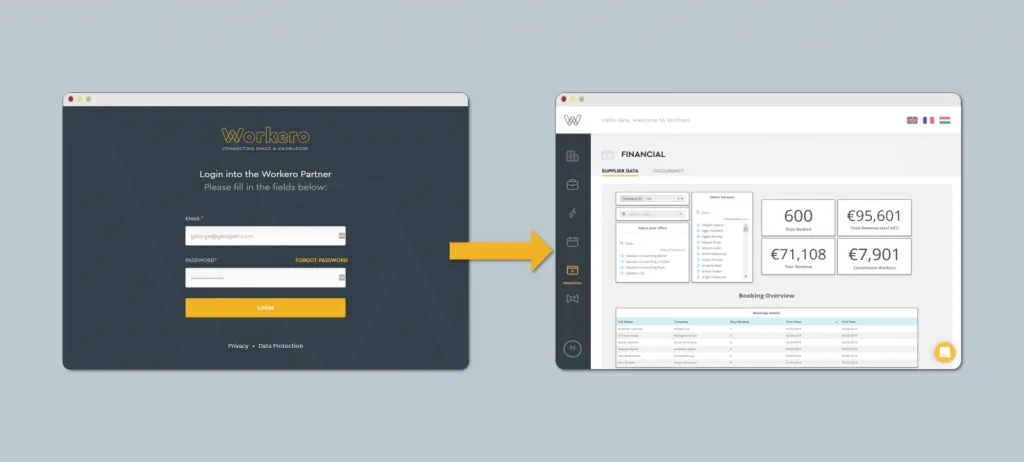
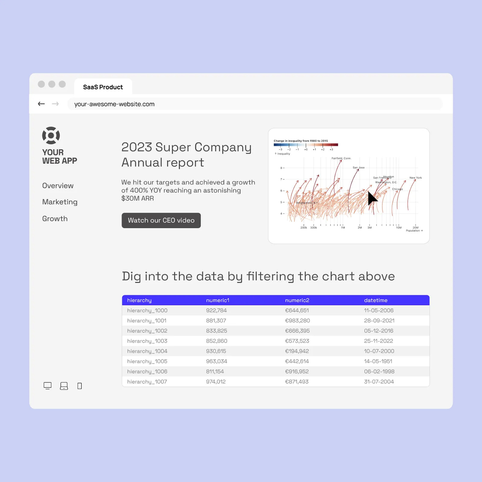
1. Data visualization tools are integrated, not isolated
Visualization software like Tableau or Power BI is phenomenal for data analysts. However, for the average business user who needs quick data points to back up their decisions, they are not very user-friendly. It’s time-consuming to extract data from many different data sources and build visualizations on top of complex datasets.
Instead of using a separate data visualization tool to analyze data, metrics and graphs will start appearing tightly integrated into the software apps we use on a day-to-day basis. Embedded analytics platforms like Luzmo Studio enable developers to integrate dashboards directly into their applications, while Luzmo IQ and Luzmo AI help users interact with those insights and analyze data without leaving their workflow.
When business users get access to insights in their workflows, making data-driven decisions becomes more natural.
2. Traditional dashboards are going out of style
If you’ve ever worked with enterprise software systems, you’re probably very familiar with the traditional KPI dashboard. Usually, they are hidden behind a tab called “analytics” or “reporting”, and they open up to a boatload of dashboards and reports.
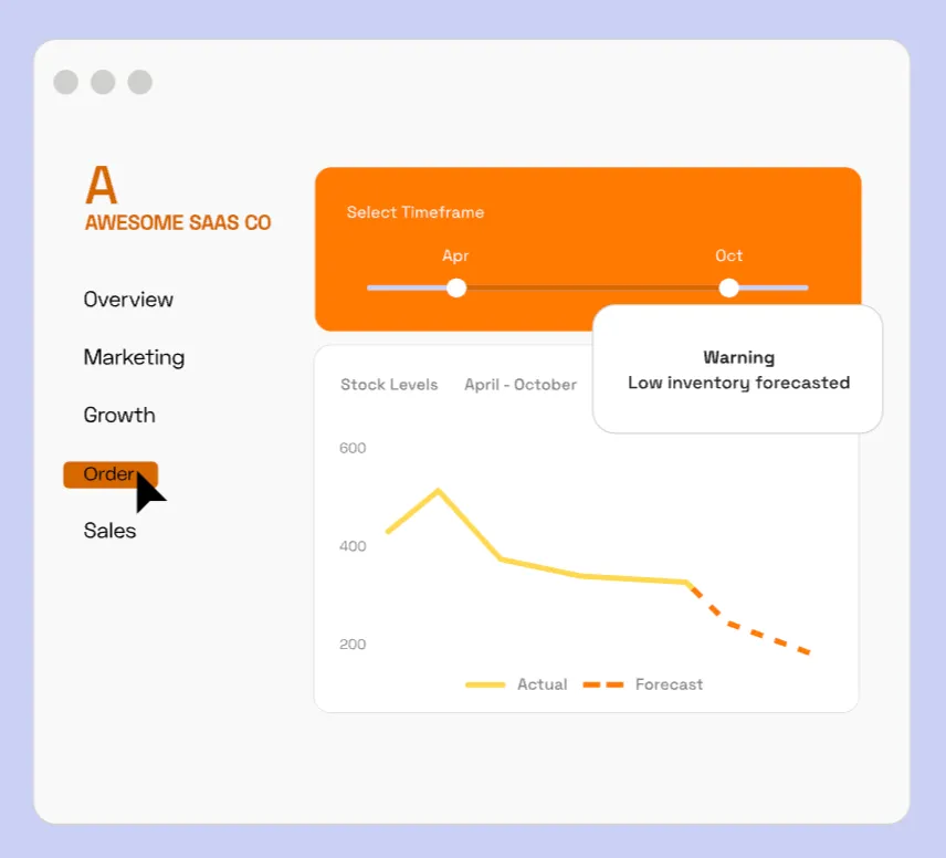
These traditional KPI dashboards are making way for a more immersive data analysis experience. To break free from a fixed canvas, more and more software applications are seamlessly blending charts into other parts of their application. As a result, insights are appearing everywhere: from single charts to pop-ups, browser extensions, email alerts,... For example:
- While you’re doing inventory management, a chart pops up and signals which products will likely run out of stock
- While building an email marketing segment, you can open a side panel “Insights”, showing your top engaged segments to make better-informed decisions
- You want to add visualizations to an annual report, blended together with text, call-to-actions, video and other app components
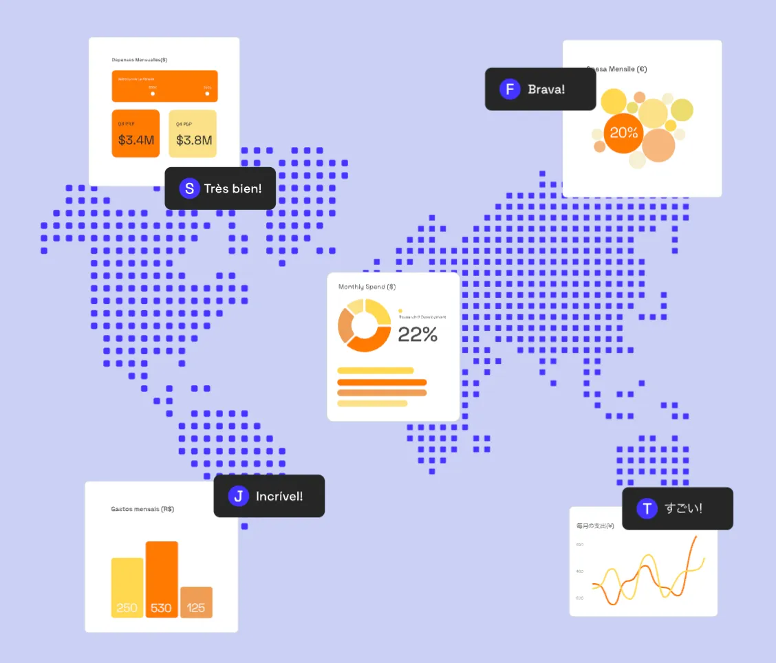
3. Hyper-personalized insights become the new norm
Imagine you’ve built a social media platform for marketers. Naturally, the head of marketing will look at different KPIs than the social media manager. And even then, two social media managers with the same role at different companies may care about totally different metrics too. It all depends on their context.
Modern data visualizations will take into account a user's context. If company A posts only on TikTok, they will see metrics like video views and follower growth rate. If company B, on the other hand, uses LinkedIn for B2B advertising in order to find leads, they will see metrics like cost per lead and number of downloads.
Other ways of personalizing the experience include localization, presenting data in the user’s own language and timezone, as well as responsiveness. No matter when a user wants to view insights, they should adapt to look great on desktop, tablet or mobile devices.
In terms of user experience, this is groundbreaking for your product users. They get served with the most relevant, valuable insights in their preferred language.
4. Customizable and user-centric interfaces
Even with advanced personalization, certain ‘power users’ will want full control over their data. They want to dive deeper into raw data, or explore niche metrics. For that reason, customizable interfaces to analyze your data are gaining in popularity.
More and more modern software apps adopt a user-centric design for analytics. Think of user interfaces where software users can create their own charts, pin them to your app’s homepage, or select widgets from a set of templates you offer them.
5. AI takes data democratization to the next level
Data analysis is no longer a privilege for data scientists or large enterprises. This has been an emerging trend over the last years, but with recent advancements in artificial intelligence, data democratization will further explode.
Thanks to generative AI interfaces, users will be able to analyze big data sets using natural language. Imagine typing a simple question – “What was my best-selling product in the last quarter?” – and then getting a pie chart in return, presenting data about your product sales.
With the help of machine learning algorithms, data analytics will become a much more conversational process. And that goes hand in hand with data storytelling, since generative AI can help you spot compelling narratives in your data.
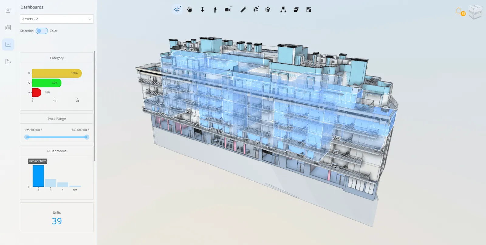
6. The future of data visualization is interactive
Static graphs are officially a thing of the past. Businesses that use interactive data visualization tools are 28% more likely to find information quicker than those who rely on static dashboards.
In the next years, interactivity will go beyond basic filtering. Modern apps will connect data visualizations to other functionalities of their product to streamline the decision-making process. Imagine you’re looking at a stock chart in your investment app, and you’re able to immediately sell the stock when the price hits a certain threshold.
For a truly immersive experience, elements of virtual reality and augmented reality are making their way to data visualization. Think of 3D animations - like this 3D model of an apartment building - which you can filter and control through interactive data visualizations.
7. Real-time data visualization
When you need to make an important decision, time is of the essence. Especially in sectors like healthcare, manufacturing, finance, a slow decision could cause huge losses, both financially and on a human level. And on the contrary, 80% of companies who used real-time data analytics saw an uplift in revenue.
Real-time insights is a cornerstone for effective data visualization. No matter how beautiful your charts are, if the information is outdated, it’s not useful. With modern visualization techniques, like real-time alerts or pop-ups, teams can take action much faster on very complex information.
September 2025 updates
We recently surveyed over 200 SaaS leaders for Luzmo’s Dashboards: Dead, Dying, or Evolving? report, and the findings add even more urgency to these trends.
- Dashboards disappoint. 40% of users rate their dashboards 3/5 or lower, and 72% export to Excel when dashboards fail to deliver. Static reporting clearly isn’t meeting expectations.
- Build cycles are too slow. 41% of teams spend over four months building dashboards, while nearly 40% get 10+ user requests each month for changes. No surprise that 67% of leaders have low confidence in their analytics today.
- Interactivity is top of mind. 42% of users want better filtering, sorting, and drill-down options. Another 38% want personalization baked in, not bolted on.
- AI is now a baseline. 78% say AI has already improved their work, and 70% believe it will be a differentiator in how products deliver insights.
Taken together, these numbers show why traditional analytics models no longer cut it. Users aren’t asking for dashboards. They’re asking for decisions.
Data visualization trends for embedded analytics in software products
The macro trends in data visualization — AI querying, personalization, integration into workflows — all play out differently in embedded analytics than they do in standalone BI tools. The embedded context has specific constraints and specific opportunities that shape which trends matter most.
Composable analytics is replacing monolithic dashboards
The fixed dashboard — a static grid of charts on a dedicated analytics page — is giving way to composable analytics, where individual chart components can be placed anywhere in the product, not just on a reporting screen. A metric appears inline in a workflow, a trend surfaces in a side panel, an anomaly alert triggers inside a notification. This requires a different technical architecture from traditional dashboards, but it produces an analytics experience that feels like part of the product rather than bolted onto it.
White-label and brand-native experiences are becoming the standard
In the early days of embedded analytics, third-party tools embedded via iframe were visually distinct from the host product — different fonts, different colors, different interaction patterns. Users noticed. Today, the expectation is that analytics features look and behave like they were built by the same team that built the rest of the product. This requires deep styling control and interaction parity, not just a logo removal option.
End-user permissions and data scoping are growing in complexity
As analytics features reach deeper into products and serve more diverse user bases, the complexity of managing what each user can see and do grows significantly. Enterprise customers expect row-level security, role-based view access, and the ability to restrict which metrics different user types can explore. Building this flexibility into an embedded analytics implementation from the start is far easier than retrofitting it later.
What these trends mean for software product teams building analytics in 2026
Each of the trends covered in this article points in the same direction: analytics features are becoming a core part of the product, not a reporting add-on. That shift changes the build-vs-buy calculus significantly.
When analytics is a peripheral feature, it is reasonable to spend minimal engineering resources on it and ship something basic. When analytics is part of the product experience your users evaluate, compare, and pay for, the quality bar is higher — and the cost of under-investing is visible in retention, expansion, and competitive positioning.
The specific trends that have the most immediate impact for product teams are AI-powered querying (which users now encounter in enough products to have expectations), personalization (which requires infrastructure beyond a static dashboard), and composability (which requires rethinking where analytics lives in the product, not just what charts to show).
Building all of this from scratch is a multi-year engineering investment. Using an embedded analytics platform that has already solved these problems — and continues to evolve them — lets product teams focus on their core differentiation. Luzmo AI is built specifically for this use case: AI-powered, composable, white-label embedded analytics that ships in days rather than months.
Conclusion
The field of data visualization is changing rapidly, and as a software developer, it can be hard to keep up with all the latest trends. You need to build data-powered products, but at the same time, analytics is just one piece of the complicated product puzzle.
And it doesn’t get easier, because software users are raising the bar. They expect data insights to be:
- Embedded in your software product
- Blended with other app functionalities
- Hyper-personalized
- Customizable to their needs
- AI-powered
- Highly interactive
- Available in real-time
If you’re looking to develop visualizations from scratch, matching all of these requirements, tough luck. For a faster and easier alternative, try Luzmo instead. Our flexible toolkit for analytics makes building a superior analytics experience a breeze.
With Luzmo's low-code embedded analytics platform, you can inject interactive charts and dashboards straight into your application with just a few lines of code. Use real-time data connectors and an AI-powered chart generator to give your customers the experience they desire.
And if you’re looking for even more customization, hyper-personalization, and a truly immersive experience, stay tuned for what’s coming next! Soon, Luzmo is launching a brand-new code-first analytics SDK.
Book a meeting with our product experts, and let us help you elevate your in-app data visualizations! Plans start at $495/month for Starter, $1,995/month for Premium, with custom Enterprise pricing available as you scale.
FAQ
All your questions answered.
What is the biggest data visualization trend in 2026?
The biggest data visualization trend in 2026 is the shift from standalone dashboards to embedded, AI-powered analytics integrated directly into software applications. Instead of opening separate reporting tools, users now expect insights to appear in context, such as within workflows, side panels, or real-time alerts. AI-powered analytics tools like Luzmo IQ and Luzmo AI also allow users to explore data using natural language, making insights accessible to non-technical users.
Why are traditional dashboards becoming less effective?
Traditional dashboards are becoming less effective because they are often static, disconnected from user workflows, and slow to update. Modern users expect interactive, personalized, and real-time insights that help them take immediate action. Embedded analytics platforms like Luzmo Studio allow developers to integrate dashboards directly into their applications, while AI tools help users uncover insights faster and without relying on analysts.
How is AI changing data visualization?
AI is transforming data visualization by automating analysis, generating charts, and allowing users to interact with data conversationally. Instead of manually building reports, users can ask questions in natural language and instantly receive visual answers. Tools like Luzmo AI and Luzmo IQ help users identify trends, correlations, and anomalies automatically, while platforms like Luzmo Studio enable teams to present those insights through interactive dashboards embedded directly into their software.
Written by

Ship the future of your data
Let us show you what Luzmo can do for your product.

Leave your e-mail and one of our analytics experts will reach out to you