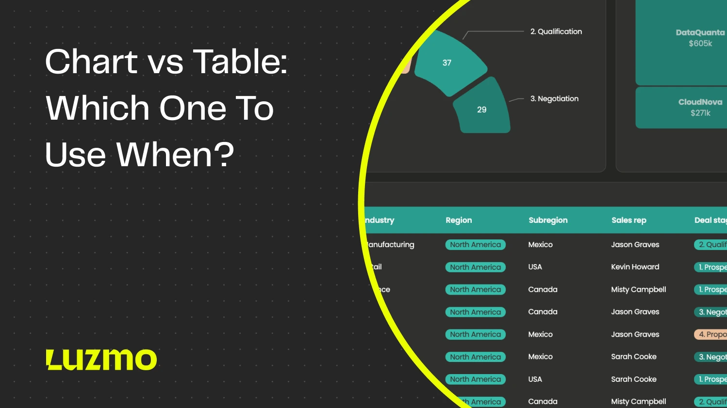
Chart vs. Table: Which One to Use and When?
Imagine trying to mow your lawn with a pair of scissors. Sure, you would eventually get it done, but is it really the best tool for the job? The more complex the job you’re tackling, the more expensive it is to use the wrong tools. When you do data visualization, choosing the right visualization type makes all the difference.
Today, we talk about charts vs. tables. Both are commonly used elements for visualizing data but they’re not interchangeable. Making the wrong choice will be like mowing a lawn with scissors: long, painful and the end result will look dreadful.
What are charts?
Charts or graphs are visual representations of data that make it easier to understand complex information. When a dataset is converted into a chart such as a line graph or a bar graph, the reader can more easily interpret the data, find patterns and outliers, discover relationships and in general, understand the meaning behind the data presentation.
Tools like Luzmo Studio make it easy to build these charts into interactive dashboards, while AI assistants such as Luzmo IQ and Luzmo AI can automatically analyze datasets and suggest the best chart types based on the data and business context.
Different types of charts are used to present data in various use cases, such as data analysis, finance, education, science and many others.
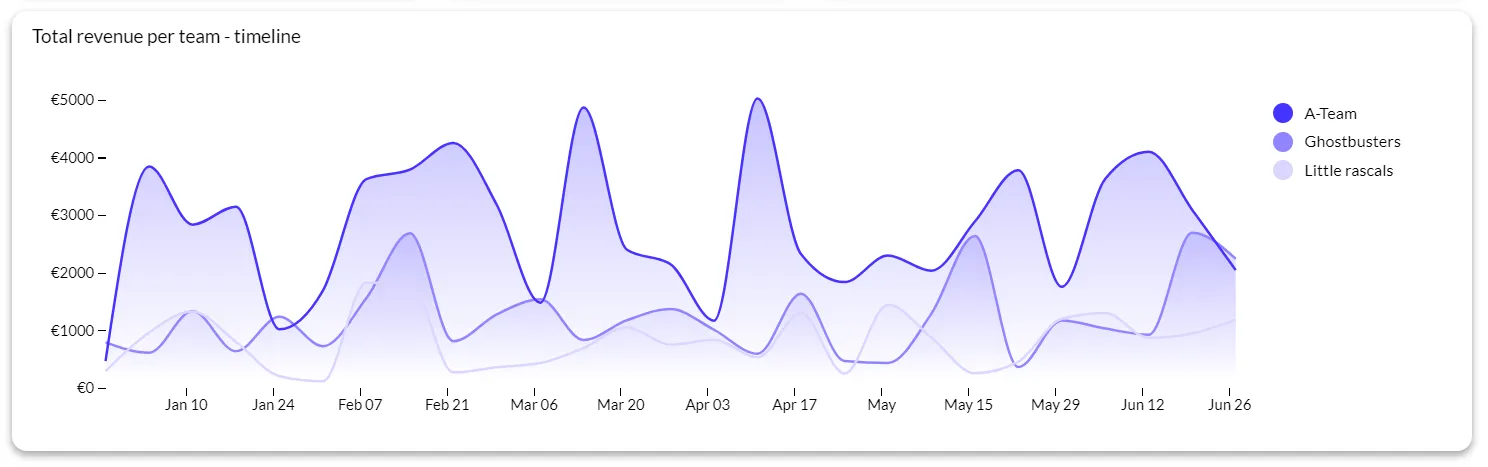
An example of a line chart
Some of the most common chart types include:
- Bar chart
- Line chart
- Pie chart
- Histogram
- Scatter plot
- Area chart
- Bubble chart
- Radar chart
- Heat map
- Gantt chart
What are tables?
A table is a set of data points organized in rows and columns for an easier overview. Tables are used in and outside data analytics to show complex data with exact values in a way that is easy to compare.
Tables are present in apps such as Excel, on websites, in apps and various other places where it’s necessary to show large amounts of data at once. Most tables look the same and have the same use case (except for maybe pivot tables), unlike charts that have numerous variations for different use cases.
Of the two visual representations of data, tables are more difficult to read at a glance. While they contain precise values and percentages, that data does not tell a story. It is up to the reader to interpret the numerical data, find patterns, and draw conclusions on their own.
When should you use charts?
Charts are incredibly versatile and you should choose them based on who is reading and what your intention is. These are some of the main use cases for charts:
- For highlighting trends: showing changes and trends over time
- Comparing data: to compare different categories or groups with bar charts or column charts
- Visualizing proportions: to show parts of a whole with chart types such as pie charts and stacked bar charts
- Identifying relationships: to determine correlations and relationships between variables with visualizations such as scatter plots and bubble charts
- Simplifying complex data: when working with large data sets, understanding data from tables is nearly impossible, and this is where various types of graphs come in
- Engaging your target audience: when staring at a data table would lull your reader to sleep, a chart is the better choice to show the same sets of data in a more interesting way
When should you use tables?
While they are not as versatile as charts, tables have their own use cases where they are clearly the better of the two choices.
This is when you should use tables:
- Showing precise data: in use cases such as financial reports, where detailed numerical data needs to be examined, with each number and decimal
- Presenting multiple variables: when showing data with multiple variables side by side for an easy comparison
- For data lookup: when the end-user needs to find a specific data point, tables are the superior choice
- Displaying non-numerical data: for showing a combination of numerical values and words
- When data doesn’t fit well into a chart: for those cases where the data is irregular and it’s hard to make out the relationships between data points
When to use both: combining charts and tables in one dashboard view
The chart vs. table framing implies a choice between two alternatives, but many of the most effective dashboard designs use both simultaneously — with each element doing a different job in the same view.
The most common pattern is a summary chart paired with a detail table. The chart gives the user a visual overview — a trend, a proportion, a comparison — that communicates the top-line story at a glance. The table below it provides the exact values for users who need to investigate further, verify a specific number, or export the data for their own analysis. Neither element can do what the other does well, so combining them covers both needs without forcing a trade-off.
A second pattern is a chart that acts as a filter for the table beneath it. The user clicks a bar in a bar chart to filter the table to only the data from that category. This is an interaction pattern that requires both elements to be present: the chart provides the navigation affordance, the table provides the detail. Neither works alone for this use case.
A third pattern is using a small inline chart — a sparkline — inside a table cell to show a trend alongside an absolute value. A table of sales reps with columns for current month revenue, year-to-date total, and a sparkline showing the last twelve months gives the reader quantitative precision and trend context in the same row.
The design principle underlying all three patterns is the same: give users a fast visual answer and a precise numerical answer in the same place. Luzmo AI can generate either format in response to a natural language question, and can combine both when the question calls for it — removing the need for a designer to anticipate every combination upfront.
Charts vs. tables - which one is better?
There is no right answer: it depends on the data type you’re working with and the intended audience. Before choosing between charts vs tables, ask yourself:
Who should read this? What will they do with this data?
Once you have answers to these questions, you’ll know the exact way to visualize your data.
However, do not forget that there is always the third option: using both charts and tables.
For example, you can use a bar chart that shows the most sold products in a store. You can then filter here to find the best-selling product. Below that, you could review all the transactions for that product in a table. You can have the best of both worlds in one dashboard.
To sum things up, charts are better when you want to communicate insights quickly and engage your audience. Tables are better when you need a focus on precision and detail and the ability to show multiple variables of data in one place.
Chart vs. table in embedded analytics: what your end users actually prefer
In an internal reporting context, the person who builds the dashboard and the person who uses it are often the same, or at least work closely together. In embedded analytics — where you are building data features for the users of your product — you are designing for an audience you may not know well, with varying levels of data literacy and very different jobs to do.
Luzmo's research on dashboard usage found that 72% of users regularly bypass dashboards by exporting to Excel. The most common reason is not that charts are wrong, but that users need a level of precision and manipulability that charts cannot provide — they want to filter by a specific criterion, sort differently, or combine the data with something from another source. That behavior is a signal to include tables, or at least table export, alongside charts in embedded analytics.
The preference also shifts by user type. Executive users consistently prefer charts: they want the headline number and the trend, without having to parse rows. Operational users — account managers, customer success reps, finance teams — frequently prefer tables because they are looking for specific values, comparing records, or building their own summaries. A dashboard that only offers one format forces half its users into a workaround.
A practical approach for embedded analytics is to make the format switchable. Present the chart by default for visual appeal and immediate comprehension, but give users a control to switch to table view when they need precision. This accommodates both preferences without requiring a separate design for each user type.
Decision guide: charts vs. tables by data type and question
The most reliable way to choose between a chart and a table is to start with the question the viewer is trying to answer, then work backward to the format that answers it most directly.
Use a chart when the question involves change, comparison, or proportion
If the question is "is this going up or down?", a line chart answers it immediately. If it is "which category is largest?", a bar chart communicates the ranking visually faster than a table. If it is "what percentage of total does this represent?", a donut or stacked bar chart makes the proportion legible at a glance. In each case, the visual encoding — position, length, color — does the interpretive work so the reader does not have to.
Use a table when the question involves specific values, lookup, or comparison across many attributes
If the question is "what was the exact revenue for customer X in March?", a chart cannot answer it — a table can. If the user needs to compare ten metrics across eight categories, a table handles the density that a chart cannot. If the viewer needs to sort, filter, or export the data for further analysis, a table is the only format that supports those interactions.
Use both when the question has a visual headline and a numerical detail
A summary chart that shows overall performance combined with a table that shows the breakdown by segment, rep, or product gives users both the story and the data to interrogate it. This is the default design pattern for most effective executive and operational dashboards.
Visualize data in your software with Luzmo
If you want to present data in your software, using only tables is out of the question. Your end-users need to understand the data and make decisions quickly, and tables just won’t cut it for this use case. This leaves us with charts.
But how do you choose the right one? With Luzmo AI, you give us the raw data and we take care of the rest. Pricing is transparent and starts at $495/month for Starter and $1,995/month for Premium, with Enterprise plans available as you scale. Based on the type of data you have and the end goal you have, we’ll suggest the best way to present your data for the most impact.
Want to find out how to embed Luzmo in your software and show dashboards to your end users? Book a free demo with us to learn more!
FAQ
All your questions answered.
When is a chart better than a table?
Charts are better when you need to spot patterns, trends, and comparisons quickly. For example, a line chart shows trends over time far more clearly than rows of numbers in a table.
When should you use a table instead of a chart?
Use tables when precise values matter, or the reader needs to compare exact numbers rather than visual patterns. Tables are ideal for detailed reference or financial figures.
Can charts and tables be used together effectively?
Yes. Combining them lets you give the best of both: a chart for insight and a table for accurate values. For example, show a trend line with a table of the underlying numbers for reference.
Do some audiences prefer tables over charts?
Yes, analysts and executives who need exactitude often prefer tables, while broader audiences tend to digest visual summaries more effectively. Choosing the right format depends on reader intent.
Written by

Ship the future of your data
Let us show you what Luzmo can do for your product.

Leave your e-mail and one of our analytics experts will reach out to you