Bullet Chart: What it is and Where to Use it
Back in the day, reports and dashboards were filled with gauges and meters which took up space and were difficult to read. That is until Stephen Few came up with the bullet chart, also known as a bullet graph.
So what is this chart type, and what should you use it for? Let’s explain in detail.
What is a bullet chart/bullet graph?
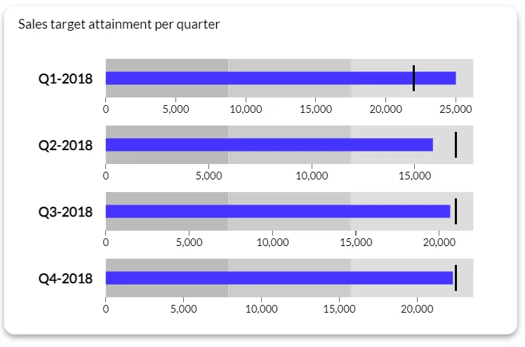
A bullet chart or a bullet graph is a one-dimensional type of visualization used for showing progress or performance against a set target. Stephen Few designed it as a way to quickly show the most important data in a space-efficient and informative way.
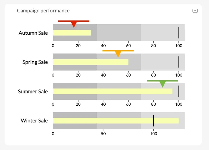
The key components of a bullet chart are:
- Main bar: shows the actual performance of a metric (e.g. current revenue, churn rate), also called a reference line
- Target marker: vertical line showing the target or goal for a certain metric
- Performance ranges: shaded bands in the background that show qualitative ranges and intensities.
Bullet charts are one of the most popular types of charts across industries because of their simplicity and the ability to show a lot of information in a single visualization.
You’ll find them in the most popular business intelligence tools, such as Luzmo Studio, Power BI, Tableau and similar platforms. Tools like Luzmo Studio allow teams to build dashboards with bullet charts and other KPI visualizations, while Luzmo IQ and Luzmo AI help users explore performance metrics, generate insights, and create visualizations automatically using AI-powered and natural language interactions.
The best use cases for bullet charts
It’s time to kiss dashboard gauges goodbye and stop using visualizations that look like they came out of Excel. Here’s a quick tutorial on the best use cases for a bullet graph.
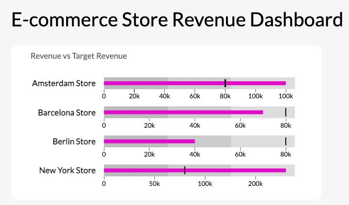
Comparing performance against a target
When you want to show your current performance against a target, a bullet graph is the ideal tool for the job. The main bar is used to display the current performance (the actual value), while the vertical marker shows the target value you want to achieve.
If you only have a short amount of time to show your target audience one value with no additional context, this is what bullet charts are built for.
Showing progress towards goals
Similarly to the first use case, if your team is working on a KPI, you can show them two values instead of an entire dataset.
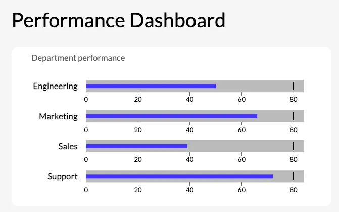
Visualizing key metrics (KPIs)
If you have little room to spare and there’s a small dashboard that needs to show powerful data points as a primary measure of success. Revenue, customer acquisition, profit: these are all displayed well with a bullet chart.
Highlighting performance bands
With colored bands in the background, you can add a qualitative scale to your visualization. For example, you can show poor, average, and good performance with background colors in three different sizes on a bullet chart.
Bullet chart examples in embedded analytics: software use cases
Bullet charts are particularly well suited to embedded analytics because they answer a specific, high-value question — "are we hitting our target?" — in minimal space. For software products where dashboard real estate is limited and users want immediate status at a glance, the bullet chart's density is a feature rather than a constraint.
Customer health score vs. benchmark
A customer success platform can use bullet charts to show each customer account's health score against the industry benchmark or the target threshold for renewal risk. The main bar represents the account's current score. The target marker shows the threshold below which the account needs attention. The background bands indicate poor, at-risk, and healthy ranges. A customer success manager scanning ten accounts can immediately see which are below threshold without reading a single number.
Feature adoption rate vs. target
A product analytics dashboard embedded in a software tool can use bullet charts to show feature adoption rate for each major feature against the adoption target set by the product team. If the target for a feature is 60% of active users and current adoption is 41%, the bullet chart makes that gap visible at a glance alongside the qualitative context of whether 41% is in the poor, acceptable, or good range for that specific feature.
Quota attainment per sales rep
A CRM with embedded analytics can use a row of bullet charts — one per sales rep — to show quota attainment for the current period. Each bar represents the rep's closed revenue. The target marker is their quota. The performance bands show below target, approaching target, and above target ranges. A sales manager reviewing the team can spot who needs support and who is on track without opening individual records.
In Luzmo, bullet charts are available as a native chart type and can be embedded inside product dashboards with full white-label styling. Luzmo AI can surface bullet chart insights conversationally — a user who asks "which of my customers are below the health score threshold?" receives a direct answer, with the option to view the underlying bullet chart for visual context.
When not to use bullet charts
While they seem versatile, bullet charts are not ideal visual elements for every type of data. Here is when you should avoid them.
- For complex or detailed data: bullet charts are best for high-level comparisons. If you have complex breakdowns or multiple variables, stacked bar charts or line graphs are a better option.
- For multiple categories: too many bullet charts in a single view can confuse the reader because of all the data points instead of giving them a quick data breakdown.
- For tracking trends over time: this is not the strong side of bullet charts. Use line charts or area charts instead.
- For doing highly precise comparisons: for precise numerical values or a comparative measure with small differences, it’s better to use tables or dot plots.
- For cases with limited familiarity: if your audience is not familiar with bullet charts and how they are interpreted, you may add a tooltip to help them understand, or simply replace the bullet chart with something more widely used to visualize data.
Top tips for this visualization type
If you want to make the most out of bullet charts, keep these tips in mind.
- Keep it simple: use a bullet chart to convey one main point and not more than that
- Limit the number of metrics: group similar metrics together and try not to use more than one or two at a time
- Use clear performance ranges: define your background bands and their colors clearly so the reader has no problems interpreting the bullet chart
- Highlight key targets: the target marker should be easy to see so the reader can determine the performance against the goal
- Provide context to the reader: label the value, targets and performance ranges clearly so there are no misunderstandings
- Mind your sizes and proportions: the length of the bullet chart should be proportional in scale to avoid misinterpretations
- Use bullet charts sparingly: bullet charts are for key metrics, not showing data. Use them in prominent places to showcase the most important results at a glance
- Combine with other visualization types: combine bullet charts with other visualization types to tell a story, such as a bar graph, column chart or a trend line
Bullet chart vs. gauge chart: why the bullet chart usually wins
Before bullet charts became standard in BI tools, gauge charts — also called speedometer or dial charts — were the default for showing a metric against a target. Stephen Few designed the bullet chart specifically to replace gauges, and the case for that replacement is straightforward.
A gauge chart uses a semicircular dial with a needle pointing to the current value. The format takes up significant vertical and horizontal space, typically requires a large size to be readable at all, and can only display one value against one target. The visual encoding — the angle of a needle — is one of the least accurate ways for the human eye to interpret quantitative data. Two gauges with slightly different needle angles are difficult to compare.
A bullet chart displays the same information — current value, target, qualitative range — in a horizontal bar that takes roughly one-eighth the space of a comparable gauge. Multiple bullet charts stack vertically, making it easy to compare performance across metrics or categories in the same view. The visual encoding — bar length — is one of the most accurate encodings available, which makes the difference between actual and target immediately legible even at small sizes.
The cases where a gauge chart is genuinely preferable are narrow: real-time displays where the needle animation communicates dynamism (engine RPM, network throughput), or contexts where the circular format fits a specific physical or interface metaphor. For business analytics and dashboard design — which is where the choice most often arises — the bullet chart is the more efficient and accurate representation in nearly every scenario.
Visualize your data with Luzmo
Do you want to add data visualization capabilities to your software? With Luzmo, you can embed dashboards directly in your product, with a large variety of chart types and widgets. Thanks to our API and a wide range of integrations, hooking up Luzmo to your software is a breeze.
Grab a free demo with our team to see how Luzmo can help visualize data in your product! Plans start at $495/month for Starter, $1,995/month for Premium, with custom Enterprise pricing available as your analytics needs grow.
FAQ
All your questions answered.
What is the main advantage of a bullet chart compared to gauges?
Bullet charts are more space-efficient and easier to read than gauges. They allow you to compare actual performance against a target while also showing qualitative performance ranges in a compact format. Modern dashboard tools like Luzmo Studio make it easy to include bullet charts alongside other KPI visualizations, while Luzmo IQ and Luzmo AI help users automatically analyze performance and generate insights.
When should you use a bullet chart instead of other chart types?
Bullet charts are ideal when you want to show progress toward a goal, compare performance against a target, or highlight key KPIs in dashboards. They work best for high-level performance monitoring rather than detailed trend analysis. Platforms like Luzmo Studio allow you to embed bullet charts into dashboards, while Luzmo IQ and Luzmo AI help users explore the underlying data and understand performance changes.
Can bullet charts be used in embedded analytics applications?
Yes, bullet charts are commonly used in embedded analytics to help users monitor KPIs directly within software applications. Embedded analytics platforms like Luzmo Studio allow developers to integrate bullet charts into their products, while Luzmo IQ and Luzmo AI enable users to interact with their data and generate visualizations automatically using AI-powered analytics.
Written by

Ship the future of your data
Let us show you what Luzmo can do for your product.

Leave your e-mail and one of our analytics experts will reach out to you